Wednesday, July 09, 2014

Everything You Wanted to Know about Publishing a Picture Book (But Didn’t Know Who to Ask): Part 4—Publishing

Everything You Wanted to Know about Publishing a Picture Book (But Didn't Know Who to Ask):
Part 1—Introduction
Part 2—Writing
Part 3—Illustrating
Part 4—Publishing

If you've followed the instructions in the first three articles in this series, you should now have the text and the illustrations you’ll need to indie publish a picture book.  Great! This last article will show you how to combine all these elements into pdf files that you can upload to CreateSpace, so you can finally publish your book.


Create the File for the Interior of Your Finished Book

Until now, you've probably been creating or scanning and manipulating artwork in a pixel-based art program, like Adobe Photoshop (the industry leader) or Corel Photo-Paint (what I use, because it’s great and much cheaper than Photoshop). At this point, you'll probably want to transfer your illustrations to a vector-based design program, like Adobe Illustrator or CorelDRAW. This will make it easier to turn your illustrations into a multi-page PDF, which is the format your book will need to be in so you can upload it for publishing.

Click File and then New to create a new document in your vector-based design program and format it to fit the correct size, number of pages, color format (CMYK), and dpi (300) for your book. Here’s an example of a file setup from CorelDRAW for a 40-page book with an 8.5” by 11” trim size:


Import your finished artwork page by page to the correct page it’s meant to go on in the finished book and fit it so that it exactly fills the page. (Using “Snap to Page” can help you make sure that you reach the edges exactly.) Once you've done this for all of your pages, save the document before continuing.

Insert Text

Open your Word document with all the lines of text for your story (as well as the copyright page and any other extra pieces of text that are going to go into your book) already formatted in the font, size, and leading that you want in your finished book. As I mentioned in the second article of this series, I asked my writing friends about font size, and most of them said that 16 was the right size font for picture books. I went with 20, because anything smaller seemed to disappear on the page, but 16 is certainly acceptable. It’s also recommended to use a san serif font, like Helvetica or Arial, for picture books, because younger eyes find these simpler fonts easier to read. (I chose Arial Rounded, because the rounded look seemed to fit the fairy-elephant look that I was going for.) A wide leading (space between lines) also makes text easier to read, so a leading between 1.25 and 1.5 should work well. Copy and paste each piece of text from Word into the page it’s meant to go on, and then save the file again.

Layout Your Book

Make sure text is legible and contrasts with the background. Make text on dark backgrounds light, and make text on light backgrounds dark. If the background has a variety of colors, it might help to put a partially see-through dark or light background between the text and the part of the illustration where the text goes. You can also use the opposite of the color that’s in the background. For example, if the background is dark blue (which is a combination of cyan and magenta), yellow is the color that will best make the text stand out.

When I was a layout artist for a newspaper, I learned that black and red don’t work well together. Give it a try, and you’ll see how red text seems to disappear against a black background, and black text seems to disappear against a red background. Switch one of the colors for white or yellow, and you’ll also see how much better these colors work with black and red.

You can also apply drop-shadow to the text to make it stand out a bit more, like I did in this page from Fay Fairy’s Very BIG Problem:


A page from Fay Fairy’s Very BIG Problem

Add the text for the inner title page, copyright page, and any other extras that are meant to go into the book (like a dedication, a note about the author, or added information about the book or other picture books by the same author). Except for the copyright page, convert each finished page into a bitmap. (In CorelDraw X7, for example, that requires clicking on Bitmaps at the top, and then “Convert to Bitmap” on the top of the drop-down menu.) Once you do this, the text (as well as drop shadow and any other elements) will become a fixed part of the illustration. Later on, you won’t be able to undo it, so don’t convert your pages to bitmaps until you’re absolutely sure the page is the way you’re going to want it in the finished book, text included.  I recommend saving the file every time you convert a page to bitmap, just in case the program crashes at any point. It probably won’t, but large 300 dpi files take up a lot of memory, so it’s best to play it safe.

You can also convert the file containing your cover, back cover, and the spine of your book to bitmap, although I highly recommend you first give it a new name, so you can still make changes to the original file later on if necessary.

The copyright page has to be done last, because it will need to include the ISBN that CreateSpace will give you later on.

Alternatively, if you don't have a vector-based design program, you can select all of the objects on a page and then hit “combine all objects” in your pixel-based art program. I suggest doing it the other way, because most pixel-based programs don’t let  you create multi-page documents, which means you'll have to insert each page into something like Word before you can convert it into a PDF. There is, however, one advantage to doing it that way: Amazon Kindle prefers Word documents to PDFs, so creating your file in Word might make it a little easier to convert your print book to an e-book. Either way, you'll have to reformat all of your pages later on to fit a Kindle, which means you'll have to convert all of them to RGB color at 96 dpi and the right size for Kindle, which is 800 by 1280 pixels for all of Amazon’s color Kindles to date. (Black-and-white Kindles use a different format, but it makes more sense to format a full-color children’s book for the Kindle Fire) There are, however, much easier ways to format a picture book for Kindle. Download Formatting Children’s Books and Comics by Charles Spender (the fifth file on the list you'll find here) to learn more. Another option is to use Kindle Comic Creator, as this video explains: Creating a Picture Book Using Kindle Comic Creator. CreateSpace does allow publishers to publish to Kindle easily, pretty much with just the click of a button—but I have learned from experience that this doesn't work with full-color, fully illustrated books. It’s just best to format and publish your print book and your Kindle ebook separately.

Why, you might be asking, must you convert all your pages to bitmaps or “combine all objects” on each page? You have to do this because it will lower the size of your book’s interior PDF file. That’s important, because CreateSpace can only take interior files that are less than 400 MB. That might seem like a lot, but 30 or more pages at 300 dpi with layers can really add up. Combining layers into one bitmap makes the file a lot smaller, so you can upload it to CreateSpace.  


Publish It!

 So now you have almost everything you’re going to need to put together those two PDFs and publish your picture book! You still have to get an ISBN, and you’re going to have to put it on your book’s copyright page. You can buy your own, but CreateSpace will give you an ISBN for free, and using CreateSpace’s makes it easier for CreateSpace to distribute your book to more markets.

So let’s head to CreateSpace.com now.


Sign in on the left, or click on the orange “Start a title for free” button if you don't have an account yet and need to create one.

Once you've created an account and logged in, you'll be taken to your dashboard, which show “My Account” on the left, your member ID number, the CreateSpace Message Center (where you can find the emails that CreateSpace has sent you), your royalty balance for the current month, a list of your books with their ID numbers and a place you can click to order copies, and information about how many copies each of your books have sold so far this month. (Yay, I just found out I sold another copy of Why My Love Life Sucks! Thanks, paperback purchaser with excellent taste. You just made my day.) Click on the button that says “Add New Title” near the top middle of your dashboard. Or if you've already started creating your book, click on the book’s name. This will take you to the Project Homepage of that title. 

Here’s one for a picture book I'm working on called Click the Dog:


 Let’s ignore the Create and Sales & Marketing sections for now and focus on the three columns in the middle: Setup, Review, and Distribute.

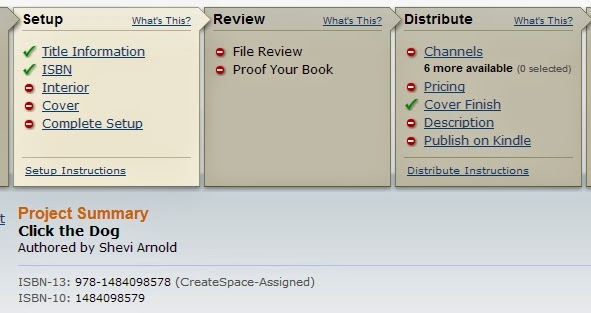
This shows the Project Homepage of a picture book I’m working on called Click the Dog. The green check marks mean that I've completed these stages. The red circles with white lines mean I haven’t done these yet. And anything marked with a clock icon is currently under review with CreateSpaceNote: once you have acquired a CreateSpace ISBN for a project, you cannot change the ISBN for that project.

Click on “Title Information” under Setup. Fill in the required information on the next page (you can tell it’s required because it has an asterisk after it). This includes your book’s title, the primary author, and the Language of your book. You’ll also want to click on the drop-down menu for “Add Contributors” to select “Illustrated by” and then click on the blue “Add” button to credit the illustrator, too. Look over all the other fields to see if there’s anything there that you need to fill in because it’s relevant to the particular book you’re publishing. When you’re done with that, click on the blue Save & Continue button at the bottom of the page. This will take you to the next page, which is the one where you can add your own ISBN (if you have one and want to use it) or get an assigned CreateSpace ISBN.
Setup, Review, Distribute, and Sales & Marketing pages on CreateSpace have this on the left. Here it is with the Setup menu open. This makes it easy to access the particular page you need to go to while you’re working on a book. You can make changes on almost anything while you’re still setting up your book, except for the ISBN. The ISBN remains fixed after CreateSpace assigns you one.

Once you have your ISBN, you can copy and paste the number into your copyright page. And once you've done that, you can turn that page into a bitmap. And once you’ve done that you’re now ready to turn the file of your book into a PDF. Yay!

The vector-design program you’re using may have three ways to do this.

1. You might see a “Publish to PDF” option in the File drop-down menu.

2. There might be a PDF option in the Print menu.


3. And you might be able to choose PDF as a format under Export.


Whichever way you do it, make sure to check all the options to verify that your PDF will have 300dpi, be in CMYK, and (if that’s available) made up of bitmaps. Once you've published, printed, or exported to PDF, open your PDF file in a PDF reader to make sure that it looks the way you want it to. If it doesn't—for example, if it's in grayscale or the illustrations don't go all the way to the edges of the page—go back to your file, try to create a PDF again (possibly using a different method), and try to see where you might have gone wrong. Eventually you should be able to create a PDF that’s exactly the way you need it to be. You’ll also need to create a PDF of the file with your book's front cover, back cover, and spine. (For more information on creating this file, check out the article about illustrating in this series. You can also check out the CreateSpace article on formatting your book's cover.)

Now that you've created the PDFs for your book's interior and its front and back cover, you’re ready to move onto the next step: uploading your book's interior.


Select “Full Color” under Interior Type, and then click on “Choose a Different Size” to select the trim size for your book. Then select “Upload your Book File,” click the blue Browse button, find the PDF of your book’s interior that you created, and double click on that.


You'll be asked to select whether or not you want the interior pages to bleed. “Bleeding” means that the artwork will go past the trim size, so that when the book is trimmed, the artwork will go all the way to the edges of the page. For most picture books, you'll want to click on “Ends after the edges of the page.”  Leave “Run automated print checks and view formatting issues online” checked. Scroll down and click on the blue Save button. Your book should now upload. This step will probably take several minutes, since you are going to be uploading a rather large file.

When it's done uploading, you'll have the opportunity to review the file online. Look over each page very carefully to see if there's anything you've missed. There could be a missing period or a word accidentally written twice. Maybe the text doesn't show up against the background as well as you'd like it. Use the double page view to check how the odd and even pages that will go together look side by side. Make sure that everything is exactly how you want it—because if it isn't, this is the last time you'll be able to easily fix what needs to be fixed.

The Interior Reviewer will automatically tell you about certain issues, like if parts of your books are less than 300 dpi, and which pages have these issues. Make sure to click on each issue so you can figure out what needs to be fixed and where. If anything does need to be fixed, you’ll have to upload a new file. Jennifer from CreateSpace put together a list of the top 10 file specification challenges publishers seem to run into when trying to upload their books and covers to CreateSpace’s website, so you might want to check it out if you run into any issues.

The Interior Reviewer from "Members' Top 10 Specification Challenges" from the CreateSpace forums, article by Jennifer, CreateSpace PrePress. Here you see what happens when an image appears to be placed too close to the edge of a page.

When the Interior Reviewer no longer finds any issues and you're completely satisfied with how your picture book looks online, click the blue Save button at the bottom. If you don't see a Save button at the bottom, try uploading your book's interior with a different browser. I ran into this problem with Chrome, but everything was fine when I switched to Firefox.

Once that's done, it's time to save your work and move onto the cover. You can go there by clicking the blue Save & Continue button at the bottom or Next at the top or of the Interior page. You can also go there by clicking on Cover under Setup on the left.


Select glossy or matte. (I don't recommend ordering a sample copy, since this will not be a copy of your book and it will cost over $6 with shipping, but that is an option.) If you're not sure which to choose, look at picture books that you have at home or from your local library. Do they have glossy or matte covers? If you see both kinds, which do you prefer? I went with glossy, because that seems to be standard, and I like the way my cover came out, but it's up to you.

Now it's time to upload the PDF you made with your book's back cover on the left, the book's spine in the middle, and the book's front cover on the right. Under “Choose how to submit the cover of your book” select “Upload a Print-Ready PDF Cover.” Click the blue Browse button, find the PDF of your cover on your computer, and double click on that.


The maximum size for your print-ready PDF cover is 40 MB, and if you converted your file to a bitmap (or combined all objects in a pixel-based art program), your file should be below that. Once you've successfully uploaded your cover, click Save & Continue.

This will take you to Complete Setup, where you'll be able to check everything over and then submit your book for review. Once you've done that, you'll see a little clock icon next to File Review on your book's Project Homepage while CreateSpace is reviewing it. When the review process is done, that clock icon will turn into a checkmark. You can then order a proof of your book. It's highly recommended that you do so, but if you’re in a hurry and you're absolutely sure the book looked perfect when you reviewed it online, you can skip this stage.  I did that with Fay Fairy’s Very BIG Problem, because I needed copies of the book for a street fair and couldn't afford to wait. (Unfortunately, it still didn't arrive in time.) The book looked exactly as it did when I reviewed it online, so I don't regret skipping this stage. Your book's proof will look almost identical to what your finished book should look like, except that it will have a page in the back with the word “proof” written in huge letters.

And now you're ready to set up your book for distribution. Yes!

I'm going to speed through this last section, because—unlike the process of putting your book together, converting it to a PDF, and uploading it—it’s mostly self-explanatory.

 You’ll start by selecting distribution channels. You’ll probably want to select all of them: Amazon.com, Amazon Europe, CreateSpace eStore, Bookstores and Online Retailers, Libraries & Academic Institutions, and CreateSpace Direct. 


Some of these channels are only available to those with a CreateSpace supplied ISBN, which is another reason why you’ll probably want to use theirs instead of buying your own.


One thing worth noting about the CreateSpace eStore is that you can give people the link to your book's page there, along with a discount code that will let them get your book for less. For example, if you go to https://www.createspace.com/4807674 and enter the discount code JHCCQCWM, you can get Fay Fairy’s Very BIG Problem for 30% less than the retail price. For the most part you'll be buying your own books at cost, which is currently $3.65 for a 40-page full-color picture book, but the link and discount code might be useful if you're trying to give a wholesaler, bookstore, or school a special deal. Of course, you can also purchase the books yourself at cost and have them shipped either to you or to the wholesaler, bookstore, or school.  
  
Once you've selected your book's distribution channels, it's time to set the price. CreateSpace takes all the guesswork out of this, by telling you what the minimum list price is for your title is in US dollars, British pounds, and Euros. It also tells you how much you'll be making in each of the distribution channels based on the prices you've set. While it might be tempting to set your price high so you'll make more money for each copy sold, be careful you don't price yourself out of the market. Paperback picture books tend to be cheap. On the flip side, don't worry if the minimum list price seems too high. Amazon and other retailers (excluding CreateSpace's eStore) will almost certainly sell your book at 10% or more off the retail price.

Finally, you enter the required information in your book's Description page. This includes the book's description (up to 4,000 characters and with limited HTML coding, but watch out for problematic characters, like apostrophes and ampersands); the BISAC category of your book (probably a subcategory of Juvenile Fiction), which you’ll select from a menu; your author biography (up to 2,500 words about your qualifications or reasons for writing this particular book); the recommended grade reading level for the book; the book’s language and country of publication; and the five most relevant search keywords for your book.


And that is how you indie publish a picture book with CreateSpace.

I hope you've found this helpful, and if you have (or if you still have questions), I hope you'll let me know in the comment section below. 


Happy writing, illustrating, and publishing!


Thursday, June 26, 2014

Creating a Picture Book using Amazon Kindle Comic Creator


I'm putting together the last article in my series on how to indie publish a picture book, and I realized it would be a good idea to point you to some helpful resources for publishing a picture book to Kindle, as well. This video on Amazon Kindle Comic Creator is a good one. Comic Creator is free, and you can download it here.

Sunday, June 22, 2014

Everything You Wanted to Know about Publishing a Picture Book (But Didn't Know Who to Ask): part 3--Illustrating

In the first two parts of this series, I showed you why you might want to publish a picture book, why I prefer to publish through CreateSpace, and what goes into writing a picture book. Now it’s time to discuss what makes a picture book a picture book—illustrations.  

Illustrate It

There are so many ways to produce artwork for a picture book; but no matter how you do it, you’ll save time and make your art look its best if you make it the right dimensions, amount of room for text, dpi, format, and so on from the start. This article is about how you can do just that when preparing a picture book for publication with CreateSpace.

Every illustrator works differently. I like to draw a storyboard as thumbnails, sketch individual pages with a pencil on a piece of paper or cardboard, ink it, scan it, and then color it on my computer. Some like to draw on a tablet, like a Cintiq, that inputs their work directly into a computer. (I’d probably do that myself if I could only afford one!) Others like to work almost entirely on paper or canvas. And still others prefer to work in clay or another three-dimensional form of art that has to be photographed before it can become a picture book. No matter how you plan to do it, it’s best to keep in mind from the start what you’ll need to make the finished book look great.


The stages of an illustration from Fay Fairy’s Very BIG Problem: a pencil drawing; the inked drawing (in this case drawn on top of a light board to let me make changes more easily and avoid unsightly leftover pencil lines or smudges); the drawing digitally colored in the correct dimensions, format, and dpi required; and the final page with text added and with all the elements combined with the background, ready to be turn into a PDF for uploading. (I did originally draw thumbnails for this picture book, but I no longer have a copy of them.)

Dimensions
It’s best if the dimensions of your artwork match the pages of the finished book, plus a bit extra for edges that will probably be trimmed off. This is particularly true if you intend to choose the bleed option for your book, and you probably will. “Bleed” means that the artwork you submit will run a little past the edges of the trimmed book. You'll probably want that, because otherwise any color backgrounds you create might have unsightly white edges if the book doesn't get trimmed exactly right (which it almost certainly will be).  

CreateSpace has a few basic trim sizes it prefers to print books in, and—except for the square 8.5”x8.5” trim size—all have portrait dimensions, not landscape. I was surprised to discover this, since I own so many picture books with landscape proportions. You'll notice that the first pencils I did for this book were in a landscape format. That turned out to be strangely lucky, because it meant I had a lot more space on the page to put text than I had originally thought. (CreateSpace does offer a landscape option when you click on “More Sizes,” but because these additional sizes aren't industry-standard, they might not fit bookstore or library shelves and aren't recommended.)

CreateSpace’s recommended trim sizes

With CreateSpace, you need to add 0.125 inches to all edges of the page that might be trimmed, which means adding 0.125” to the width and 0.25” to the height (since the top, bottom, and outside edge of the page will be trimmed, but the side of the page next to the spine won’t be). I chose the 8.5” x 11” size, because I like big picture books (they seem to work better for books that adults are meant to read to children), and because I felt the large size better reflected the title, Fay Fairy’s Very BIG Problem. This meant I had to create finished artwork that was exactly 8.625” wide (8.5” + 0.125”) by 11.25” high (11” + 0.25”).

Space for Text
Of course, the amount of space you'll need to leave for text will depend on the amount of text that will go on that page, as well as the chosen font size and leading (the space between the lines). Some old-fashioned picture books have so much text on a page that they have little or no artwork on any page that contains text, leaving illustrations to every other page in the book. Usually, these books will have text on the left and illustrations on the right. Some picture books have only have a word on each page, and some even have no words at all. Most, though, need to have about a quarter to a third of the page available for text. This space doesn't have to blank, but it shouldn't contain too many colors or include any important or distracting elements.

It’s best if the text is at least an inch away from the edges of the books on all sides—including the gutter (the side of the page that meets the spine). In fact, you should try to avoid putting anything important within half an inch of the top, bottom, and sides of the page. The external edges might get cut, and the reader might not open the book wide enough to see what’s in the gutter. This is especially true for double-page spreads.

Another thing to keep in mind when it comes to double-page spreads is to avoid putting horizontal lines near the gutter. The two pages might not line up correctly vertically, so a horizontal line might end up looking oddly higher on one page than another.  

Dimensions and Format
When you’re inputting artwork or manipulating it on a computer, work in 300 dpi (the minimum required by CreateSpace) and CMYK (which are printer colors, not computer monitor colors). Save in your art software’s native format, whatever it may be. (For example, I work in CorelDraw, so I save my files either in cdr or ctp format.) Anything else, like gif or jpg, might alter the look of your artwork or degrade the digital files each time you save them. Don't worry about compatibility issues. No matter what format you work in, you'll eventually have to convert the entire book into a pdf file when you upload it to CreateSpace (I'll go into how to do that in the next article).

I also recommend that you avoid over-saturating colors. This is something I learned when I was a comics magazine editor. It’s best to err on the side of caution. For example, 100% Cyan and 50% Magenta make a very nice dark blue. Yes, you can go with 100% of those two color and add some black to create a really dark, dark blue, but it’s overkill. When it comes to printed books, less usually works better. Also, if you can avoid putting bright red next to black, you probably should. Those two colors don't like each other (which is something I learned when I was a layout artist at a newspaper).

Storyboarding
Create a storyboard that shows you how even and odd pages will look next to each other. Remember to keep the first page alone on the right (which is the standard for books that don't start with a double-page spread), and remember that even pages of books in English will go first on the left, and odd pages will go after them on the right. Try to design side-by-side pages that complement each other or at least don’t tell a story you don't want to tell. Consider things like where your characters are looking and how the colors on these pages will best look together. In general, characters looking to the right are looking toward the next page of the story, and that’s usually (but not always) a good thing. Colors should be balanced in some way, so that if a color appears on one page, it will often help to have that color or a similar color on the facing page. Also, consider how the eye will flow through the two pages, whether any of your lines are pointing at something, and whether that’s something you want to stand out.

The first storyboard page for my as yet unpublished picture book, Happiness for a Dollar. The top line of this storyboard includes the cover, interior title page, copyright page, and the first page of the book. All lines after it show what the even and odd pages will look next to each other. You might notice that the girl in the story is facing right, while the boy is facing left. That helps indicate that she’s looking forward to the rest of the story, while he’s apprehensive.

 And Let’s Not Forget…
Aside from the story itself—which should fill 32-38 out of 40 pages—you'll need to design the cover, back cover, copyright page, interior title page, and any other extra pages that will be going into the book. Have fun with them. There’s no reason why any page in your book should be boring. Here’s the copyright page of my book, for example:

The copyright page for Fay Fairy’s Very BIG Problem
 Notice the color background and the magic wand at the top of the page.

I also used the interior title page to tell part of the story. It’s the first time the reader gets to see Fay as a fairy, and it’s important, because she doesn’t look like a fairy again until the end of the book. You’ll also noticed that I used different shades of the same color as the copyright page so the two will look right side by side. Fay’s magic wand is also on both pages.

The interior title page of Fay Fairy’s Very BIG Problem
You might want to design filler pages for the back and possibly the front of the book to make sure that a shorter story can fill 40 pages without any of those pages being blank. (This is a mistake I made, because I figured that CreateSpace would be okay with a 32-page book. That’s NOT the case. They turned my 32 pages into 36—an unusual number, considering that most printers prefer the number of pages to be divisible by eight. If I had known that, I would have filled those pages myself.)

You’ll need to have a file with just the front cover, so that CreateSpace, Amazon, and others can show the cover on your book’s page; but you’ll also need an additional file that includes the front cover on the right and the back cover on the left, with 0.002252” times the number of pages added to the width to account for the spine. For example, a 40-page picture book will need the file with the front and back cover to be 0.09008” wider than the width of the cover and back cover alone side by side. (For example, a 40-page book like mine with pages that need to be designed so that they are 8.625” wide will have a combined front and back cover file that is 17.34008” wide, which is 8.625” + 8.625” + 0.09008”) The front and back cover should more or less match up at the spine, because there’s a possibility that a part of the front cover near the spine might end up in the back, or vice versa.

Make sure that the back cover of your book has a space at the bottom right, where CreateSpace can insert a barcode.

And finally, as with the story, the illustrations in a picture book need to be clear enough to convey the story easily. Also, as with the story, they need to appeal to both the adults who will buy the book and the kids that the adults are buying the book for. Look at recently published picture books to get an idea of how the different visual elements work. And again, as with story, you can read Writing with Pictures: How to Write and Illustrate Children's  Books by Uri Shulevitz for more information on this topic.

~*~

Okay, so now you should have the text and the illustrations for your picture book ready for publication. In the next and last article in this series, I’ll show you how to prepare it all so you can upload it to CreateSpace, publish it, and start selling it.  


Everything You Wanted to Know about Publishing a Picture Book (But Didn't Know Who to Ask):
Part 1—Introduction
Part 2—Writing
Part 3—Illustrating

Part 4—Publishing

Monday, June 16, 2014

Everything You Wanted to Know about Publishing a Picture Book (But Didn't Know Who to Ask): part 2 of 4—Writing

After publishing four novels for kids, teens, and adults who love YA books, I decided to publish a picture book: Fay Fairy’s Very BIG Problem. I ran into a few problems of my own, and so I decided to write this series of articles to remind me how to avoid or overcome those problems next time, and so others can do the same.

In the first part of this series, I showed you some of the right and wrong reasons to indie publish a picture book, the skills necessary to do it right, and why I choose to indie publish with CreateSpace. Now we're going to look at the first stage of creating a picture book—writing.


Write It

If you're reading this, you probably already have something written down or you at least have a good idea of what it is you want to write. I have, however, noticed a few basic mistakes that picture-book writers often make when they're starting out.

First, a picture book should be under 1,000 words—and under 500 words is even better. Little kids have short attention spans. Make a picture book too wordy, and your book will probably lose their attention. So make it as short as you can, and make every word count.

Second, a picture book isn't just a story with pretty pictures added to it. A picture book needs pictures to tell the story. So if your story contains any words that can simply be shown in the illustrations . . . Cut. Them. Out. For example, if your story says, “Abigail had red hair,” or even “Abigail’s red curls bounced as she walked,” cut out the part about how her hair looks. Let the illustrations simply show what Abigail's hair looks like. If you're not an illustrator, don’t even mention it in the illustration notes unless it’s vital to telling the story. You might feel inclined to tell the illustrator, for example, that Abigail has red hair because your daughter has red hair, and you want the character to look like your daughter. But if it's not really vital to the story, leave it out. Let the illustrator best tell his or her part of the story the best way that the illustrator knows how. Maybe that’s drawing Abigail with red hair, but maybe it's drawing her with black hair. Maybe it’s by drawing Abigail as a bunny rabbit. The important thing is to give the illustrator the freedom to make your story the best that it can be.

The manuscript for Fay Fairy’s Very BIG Problem. Notice that the illustration notes only explain things that are necessary to the story and that are not easy to infer from the story itself. Also note that the words are in the font and format that will be used in the finished book to make it easier to copy and paste the words directly from Microsoft Word into the artwork.

Third, make your story kid, parent, teacher and librarian friendly. You’d think this goes without saying, but you wouldn't believe how many writers insist on writing stories that are meant to appeal just to kids or just to parents. Of course, you want kids to shout, “Again!” But that’s not going to happen if an adult doesn't buy the book first. Of course, you want an adult to buy the book. But that’s not going to happen if the kid isn't going to want to hear it.

You should also consider what your picture book offers a parent, teacher, or librarian that can't be found in another book. A parent, for example, might need a picture book about blended families or living with a developmentally disabled sibling or a bunch of other stuff that Dr. Seuss never considered writing about. A teacher might need a book about dinosaurs or rivers or a recent historical event or how to deal with a bully. And librarians are constantly being asked for books on topics they don’t have. Having a book on a needed topic can be a great way to land those paid classroom and library visits that—as we saw in part one of this series—can be a picture-book writer’s or illustrator’s bread and butter. Obviously, this is true for nonfiction, but it can also be true for fiction. So ask yourself what your book might offer its potential buyers, not just the kids that make up the intended audience.

One way to do this is to imagine offering your services as a visiting author to an elementary school teacher. That teacher is going to want you to do more than just read your book. What are you going to teach kids in connection with your book? Are you going to make your author visit interactive? If so, how?

Fay Fairy’s Very BIG Problem, for example, has a page in the back explaining how I created the story by taking an ancient Indian parable—”The Blind Men and the Elephant”—and changing it by asking, “What if the story were told from the elephant’s point of view?” I would start my author visit by telling the kids the original parable and how it gave me the idea for my book. Then after reading my book to the children, I would ask them to pick a story they all knew, like Cinderella, and I would ask them to see how many different stories they could create by changing parts of it, like the point of view character or the setting. It would be a creative exercise, and it would also teach them a bit about writing and the parts of a story. So how can you turn an author visit into something more for a teacher and her class? It’s something you should think about before you've even published your book.


The story behind your book—whether if it’s the story of how you came up with the idea or how you got it published—can often be a great topic for an author visit. This page at the back of Fay Fairy’s Very BIG Problem explains the simple method I used to come up with idea for it—and how the reader can use the same method to come up with his or her own story ideas.

Fourth, know the difference between a picture book that a parent reads to a child and a picture book that a child reads on his or her own. The first can have longer and more complicated words and sentence structure, but the second has to have short and easy to read words and simple sentence structure. I Love You the Purplest by Barbara M. Joosse is a good example of a book that was meant to be read to a child. Green Eggs and Ham by Dr. Seuss is a good example of a book that a child is meant to read on his or her own.

Fifth, map out your book so that you’ve worked out what text goes on what page. CreateSpace prefers picture-books that have exactly 40 pages. Subtract the interior title page and the copyright page, and that means ideally your story should fill 34-38 pages. Pay attention to the rhythm between odd and even pages. Unless your book is made up entirely of double-page spreads, odd pages should go on the right, and even pages should go on the left after the reader has flipped the page. This means that odd pages are great places to ask questions, and even pages are great places to answer them. For example, on an odd page it could say, “What should Gloria Gorilla wear to the ball?”  The child thinks about it for a moment, picturing a ball gown. The page is flipped, and . . . The child giggles as she sees that Gloria Gorilla is wearing a swimsuit, or pajamas, or a spacesuit, or pretty much anything that seems a silly answer to that question.

This is the storyboard I made for my still to be published picture book, Click the Dog. While a writer who isn't an illustrator probably won't make a storyboard, writers should map out their picture books in a similar way, using text instead of illustrations.

Study hundreds and hundreds of modern picture books. Pay attention to what goes into them, how many words they have, how the pictures tell the story, how they appeal to both the adults that buy them and the kids the adults buy them for, the length and complexity of the words and sentences they use, and how the story is mapped out. Also ask yourself if this is a story that has been told before. If so, what does your story offer that’s new? If not, why hasn’t a book like yours been written before?

And finally, when you’re sure you've written the story you wanted to write in the best way possible, edit and edit and edit it some more. Get other people to look it over for you. If you can, join a critique group for picture-book writers, get your manuscript critiqued at a SCBWI (Society of Children’s Book Writers & Illustrators) conference, or find someone nice enough to critique it on Verla Kay’s Blue Boards, which are now the official SCBWI boards. Picture books are very short, and every word has to be exactly right. There’s no room for errors. And it helps to get a second pair of eyes to look it over. Of course, you need to be open to honest feedback. Just remember it’s not about you; it’s about making your story the best that it can be.

Once you're done, put the text in the size and font choice that you want. I asked my Facebook friends, who are mostly writers and illustrators, about recommended font size. The consensus was that a 16-point font is best for picture books. However, I found that was too small for the size I was planning to print the finished book, which was 8.5” x 11”. I chose a 20-point font instead. I also discovered that nowadays sans-serif fonts are considered the norm for picture books, because they're easier to read in short passages, particularly for young children. Helvetica is considered the best, but because I work on a PC, I chose Arial, which is similar. And I chose Arial Rounded because that fit better with the soft, rounded, and elephantine look I was going for in the book. I chose a 1.5 line spacing, because more distance between lines makes it easier to read; and I chose not to paragraph indent, because there were too many paragraphs that were made up of just one line. I also made sure that the final line of each paragraph with more than one line had at least two words on it, so it wouldn't look strange. I find it’s easier to format paragraph text in Word than in a graphics program, like CorelDraw, so I did all of this in a Word file with extra-wide margins. That way I could just copy and paste the text for each page from Word directly into CorelDraw without having to make too many adjustments.

 
The inside title page and the first two pages of Fay Fairy's Very BIG Problem. Notice how the title page can also be used to tell a part of the story.

Of course, this is only the part of the writing that involves the story. You’ll also need to write a great title, the blurb (both for CreateSpace and the back of the book), your author bio (at least for CreateSpace, if not for the last page of the book), the copyright information (look at other books for ideas on how to do this), and a dedication or a whatever extra materials you might want to include. Having all these bits of writing done in advance can help make the final parts of creating a picture book and publishing it with CreateSpace a lot easier.

The copyright page from Fay Fairy’s Very BIG Problem. You can go to Copyright.Gov to get an official copyright, but don’t worry if you don’t have one: anything original you write belongs you the moment you write it down, whether you've purchased an official copyright or not. CreateSpace will provide you with the ISBN for your book, so it’s not necessary to purchase one if you publish with them.

For more information on writing picture books, I highly recommend Writing with Pictures: How to Write and Illustrate Children’s Books by Uri Shulevitz. Picture Writing: A New Approach to Writing for Kids and Teens by Anastasia Suen and The Complete Idiot’s Guide to Publishing Children’s Book by Harold Underdown are also great books that deal with the topic. I also highly recommend Underdown’s fantastic website, The Purple Crayon, for all things related to children’s book publishing. It’s just overflowing with useful information.


That takes care of writing your picture book. In the next article in this series, we're going to look at illustrating it. Hope to see you then!

Everything You Wanted to Know about Publishing a Picture Book (But Didn't Know Who to Ask):
Part 1—Introduction
Part 2—Writing
Part 3—Illustrating

Part 4—Publishing

Everything You Wanted to Know About Publishing a Picture Book (But Didn’t Know Who to Ask): part 1 of 4

So I recently published my first picture book, Fay Fairy’s Very BIG Problem, and I learned a few things (or to put it another way, I ran into a few big problems myself and was able to find out how to fix them).

I figured it would be a good idea to put together a series of articles about the experience, since it doesn't seem anyone else has really done that. There are a million and one blog posts about how to indie publish in general, but when it comes to publishing picture books, the information seems to be scattered in little answers to little questions all over the 'Net. This post will hopefully help me get it right from the start next time, and hopefully it will also help anyone else interested in indie publishing a picture book avoid some of the problems I ran into. 

First, why would you want to publish a picture book?

There are so many good reasons not to publish a picture book. Picture books are the most expensive books to create, because full-color books cost more to print (and most picture books have to be full color). If you’re not an illustrator, hiring a good one should cost you minimally a hundred dollars per page. Minimally. Per page. It can cost a lot more than that for good art, and you want good art. There are just too many picture books out there with bad art, and no one needs that.

So if you're thinking of publishing a picture book because you think they're easy to write and you can get your six-year-old to supply the illustrations, well . . .   

I'm not saying you shouldn't, but don't do it thinking you're going to sell a thousand or even ten copies. Do it because it sounds like a fun family project. Otherwise, don’t do it unless you’re an illustrator yourself.

Okay, so let’s say you're a writer-illustrator, like me. I was an editorial cartoonist, a newspaper illustrator, a layout artist, an arts-and-entertainment writer, and even a consumer columnist. Of course, you don’t have to have been all of that. You just have to have some talent in writing and especially illustrating, and you have to enjoy putting words together with illustrations. Illustrations are more important to a picture book than writing, because you there are lots of picture books that don’t have words or that have very few words; but there’s no such thing as a picture book without illustrations or some sort. Let’s say you're going at this with a realistic understanding of the rewards. You know you're not going to sell a lot of copies. Sure, it might happen, but that's not your expectation or your goal. You know your book will be competing against The Cat in the Hat, and Winnie the Pooh, and whoever Disney’s latest princess is for a book buyer’s dollars. And you can’t expect to win against that sort of competition.

So why are we doing this?

We're doing this because professional picture-book writers and illustrators know that the real money that’s to be made in picture books doesn't come from selling copies of books; it comes from paid school and library visits. Professional picture-book writers and illustrators also know that one leads to the other. Do a reading at a library, and chances are that some of the parents will be interested in buying copies of your book. Yes, there are author visits in middle schools, and sometimes even in high schools, but it’s generally easier to get gigs like this with picture books. It's also fun.

That was my reason for deciding to publish a picture book after having published four novels for kids, teens, and adults who like books for kids and teens. I wanted something for a younger age group; I wanted something for library visits, school visits, and parents with small children at street fairs. And I understand I’m still not finished, because during the last street fair I participated in, I met some kids and parents who were looking for early chapter books, the kind of thing suitable for third grade. I actually have one of those I started to work on, Gloria Turkey: Biggest Bird on Broadway, a funny tall tale about the creation of the first Macy’s Thanksgiving Day Parade. It’s on the backburner (along with several other books), because it will require a hundred or so more illustrations than I've already put into it (about 50 or 60). But at least I've now expanded my potential audience with my first picture book.  

Getting back on topic, let’s say you have what it takes to make a picture book, and you’re going into this with reasonable expectations. Since youve decided to go it on your own, the first thing you’re going to want to do is find a service that will print and distribute your books.

I picked CreateSpace for Fay Fairy’s Very BIG Problem.

Why CreateSpace?


CreateSpace and Lightning Source are the two most popular printers for indie published books. CreateSpace belongs to Amazon, which makes it super easy to get your book published with them available on Amazon. Lightning Source belongs to Ingram, which is one of the world’s largest distributors of books to schools, libraries, and brick-and-mortar bookstores, which means that using Lightning Source makes it easier to get your books into schools, libraries, and brick-and-mortar bookstores. I use Lightning Source for my hard cover books, because CreateSpace has yet to offer hardcovers as an option; but I use CreateSpace for everything else because it’s just easier to work with—and it’s free.

“Easier,” however, doesn't mean trouble-free, hence the problems I ran into and the need for this series.


Okay, so now you know the why, who, and where. The next article in this series will deal with the most important question: how? The next article will be all about writing a picture book for publication. Don’t miss it!

Everything You Wanted to Know about Publishing a Picture Book (But Didn't Know Who to Ask):
Part 1—Introduction
Part 2—Writing
Part 3—Illustrating

Part 4—Publishing