Showing posts with label fiction. Show all posts

Sunday, July 31, 2016

How to Get Rid of the Ugly Green Lines Under Your Lovely Words in Microsoft Office Word

Are you writing fiction or blog posts? Is Microsoft Office Word telling you contractions are a problem? Incomplete sentences are a problem? And other things that are stylistic choices you're free to make as a writer are problems? 

No, the rules of writing haven't changed. It's just that Office is now set for academic writing, not any old kind of writing (Why do they think there's only one kind of writing?!), but you can fix this issue. I found solutions online, but they weren't very helpful, probably because they were for older versions of Word. This solution is for the latest version (although it's possible it might be good for slightly older versions, as well).

Here's how you can fix this problem: The next time you see that pesky green line under your beautiful words, right-click it and then click "grammar" in the pop-up window. That will open this screen: 

(Please don't try to read the words under the window in this screen grab. They contain several huge spoilers for Why It Still Mega Bites, the second book in the Legend of Gilbert the Fixer, and you don't need that.)

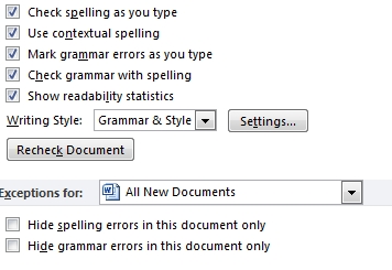
See where it says Options at the bottom left? Click that. The next screen should open with"Proofing" highlighted in the left-hand column. In the pop-up menu to the right of that, scroll down to where it says "Writing Style: Grammar & Style" and click the "Settings" button next to it. That will give you the "Grammar Settings" menu shown here:


Go through the options and unclick the things you don't want to be corrected on, like fragments and run-ons, contractions, sentence fragments, sentences beginning with and, and so on. Then click "Okay." This will take you back to the previous menu.

Near the bottom of the menu on the right, you'll see "Exceptions for." Click to open the drop-down menu and select "All New Documents" and then click "Okay" at the bottom of that menu.


And that's it. Yay! You've made those pesky green lines go away!

You're welcome.

Friday, May 27, 2016

Words for Nerds #AtoZChallenge--X is for eXtreme Writing (the ONLY way to write)

Improv says you have to “commit 100%.”

One of my rules of comedy is that you should, “take it as far as it will go. All the way up to the edge . . . and then push.”

And as I’ve told members of my critique group (please excuse the PG language), “Don’t do anything half-assed. It should be full-assed or nothing!”

I honestly mean that.  

What I’m talking about is extreme writing—and it’s the only way you should write.

I think if you look at any successful book, you’ll see the author didn’t hold back, didn’t do things by half. Whatever the author was doing, the author did it all the way. You might like it. You might hate it. But either way, you have to respect that whatever the writer’s vision was, that writer went for it.

Take Harry Potter as an example. That book isn’t just about a boy with magical powers who waves a wand and recites spells. There’s a whole magical world around him that’s rich with detail. Hogwarts has a history. Letters are delivered by owls. Food comes alive. Trees can attack you. Staircases move. Paintings talk. Ghosts roam the halls. J.K. Rowling didn’t do things by half. She took it all the way up to the edge and then pushed.


Or Gilbert Garfinkle from Why My Love Life Sucks (The Legend of Gilbert the Fixer,book one). I didn’t set out to write a series about just any geek; I set out to write a book the ultimate geek. Gilbert isn’t just a hacker; he’s the ultimate hacker. He’s not just a nerd fighter; he’s the ultimate nerd fighter. He’s not just a fan of Star Trek; he’s a fan of pretty much every form of geek or nerd culture. And I wasn’t going to give him a little problem. I gave him the ultimate teenage geek’s ultimate nightmare: getting stuck with a gorgeous vampire girl who wants to be his platonic BFF, literally forever!

Now that’s extreme writing.

You don’t have to write fantasy, science fiction or comedy for your writing to be extreme. You can commit 100% to writing a quiet book, too. Just don’t set out to make a quiet book with a few exciting scenes, or an exciting book with a few quiet scenes. Whatever choice you make, stick with it! Commit to it! Don’t waffle. Unless, of course, you’re all about waffling, in which case, I want to see you waffle like an IHOP! I want to see you waffle like no one has ever waffled before! I want you to be the King or Queen of Waffles!


Like many people, The Shawshank Redemption is one of my favorite movies. I love it because the hero, Andy Dufresne, isn’t just ordinary—he is extremely ordinary. He isn’t just boring—he is extremely boring. He’s an accountant, for goodness sakes! His hobbies include playing chess and reading. How boring (in the eyes of most people, not a book addict like me) can you get? His favorite music is opera. Opera! Andy is as ordinary as a piece of coal, but here’s the thing about coal: under a great deal of pressure, a piece of coal can turn into a diamond. And that for me is the beauty of this movie. Andy Dufresne succeeds—not despite being extremely ordinary and boring—but because of it.  

And that, I think, is a metaphor for extreme writing. Take something that could be boring and ordinary, put it under the pressure of making it extreme, and watch it shine. 

It honestly doesn’t matter what you’re writing about. As long as you make it extreme, your story will be more compelling for it. 

Wednesday, May 11, 2016

Writing Words for Nerds #AtoZChallenge--N is for (use the) News

The news can be a double-edged sword.

On the one hand, it can make you more aware of what’s going on, which is good. For a fiction writer, it can inspire ideas for stories. It was a news story that inspired my YA romantic ghost story, Ride of Your Life, and science news helps inform the science in my teen science-fantasy comedy series, The Legend of Gilbert the Fixer.


But then there are the drawbacks: being obsessed with the news can gobble up time that would be better spent doing other things, like writing. The news tends to focus on bad news, too, which can be depressing and troubling. There’s also a lot of misinformation and bias. The news rarely gives you the “the truth, the whole truth, and nothing but the truth.” There are always those who will manipulate the facts, or even blatantly lie about what the facts are. You can get media burnout just trying to find out what the real story is.

I know about the news from both sides. My family has been in newspapers for five generations, and I don’t mean we ate fish and chips in the UK (where it used to be sold wrapped in newspaper). No, I mean we’ve been working in the newspaper business that long. I was a consumer columnist and arts-and-entertainment for the Jerusalem Post. Before that, I was an editorial cartoonist, a job that requires a deep and current knowledge of the news. My mom edited the women’s section of two different newspapers between the fifties and the start of this century. Her father was a newspaper writer and editor. Her grandfather (on her mother’s side) was a newspaper writer and editor. And finally her great grandfather on her mother’s mother’s side was a newspaper writer and editor. Five generations all leading up to me.    

I’ve seen both sides of that sword. It’s been a blessing and a curse. I love the news when it’s honest. Today the journalists with integrity stand out, because they’re very much in the minority. I also love little stories about ordinary people accomplishing great things, humorous news, and learning about scientific discoveries and breakthroughs. I hate the news when it’s deceptive and manipulative, and that just seems to be getting worse and worse. Most people don’t trust the media nowadays, and to the most part I can’t blame them.

Today’s news gives you a lot of material for writing fiction, most of it in the area of satire and dystopian science fiction.

Want to know how to write either?

For satire, check out my post: Writing Words for Nerds #AtoZChallenge—H is for Humor. I came up with my House of Funny formula when I was an editorial cartoonist, which is basically like writing political satire in a drawing or two and ten words or less.

For dystopian fiction, you only have to take one bad or even potentially bad news item, look at it through a microscope so that the tiniest thing becomes huge, and then project it into the future. Of course, you better hang on tight, because that is going to be one scary ride. Or you could just listen to the current presidential candidates. They all seem to have doomsday scenarios for what’s going to happen if you don’t vote for them. Although I think it’s probably smarter to trust your own gut over what any politician tells you.


My name is Shevi, and I’m a news-aholic. 

Sunday, May 08, 2016

Writing Words for Nerds #AtoZChallenge--K is for "Kill your darlings"

It’s funny how many times I’ve had to correct inexperienced writers when they talk about the piece of writing advice that says, “kill your darlings.”

Sometimes, they think “kill your darlings” means that a writer should create a darling and beloved character, and then kill that character.  

Yeah, no.

What’s funnier still is that, even though I know this isn’t what it means, I very often do kill my favorite characters. Toren dies (SPOILER ALERT: she doesn’t stay dead. That’s hardly a big spoiler, since that’s not a ghost telling Noa the story at the beginning of Toren the Teller’s Tale. ADDITIONAL SPOILER ALERT: this isn’t The Sixth Sense). I kill off Josh and Ashley in the first chapter of Ride of Your Life, and Tracy and Mack have already been dead for thirty years before the book begins. And Gilbert is already dying at the start of Why My Love Life Sucks, although that’s just so he can become a vampire and Amber’s platonic BFF, literally forever. All things considered, he probably wishes I had actually killed him, but what kind of story would that have been? I’ll tell you what kind: it would have been a very short story.

No, what “kill your darlings” means is that you should get rid of the sentences, turns of phrase or even scenes that are so exquisitely precious that they stick out in your manuscript like diamonds in a cat’s litter box. Diamonds don’t belong there, and neither do those literary darlings. They make the rest of your manuscript look bad. You can either elevate your entire manuscript to that level, or you can do the much more logical thing and “kill your darlings.” Erase them. Cut them out. Edit them out of existence.

Of course, they are darlings, which makes them hard to kill. “But I love them so much!” you might say.

True, true. But aside from being exquisite, what do they add to the story? Do they move the plot along? Do they reveal something about a main character that isn’t revealed any other way? If the answer to both is “no,” kill them. Kill those useless darlings now.

“But . . . But . . .”

*Sigh*

Look, I hear you.

Me, I’m a ruthless editor. You should see one of my mid-editing copies of Why My Love Life Sucks. I took out lots of scene and temporarily left them in the notes section so I could reconsider using them. My daughter loves this draft. She calls it the one “with the deleted scenes.” And some of those deleted scenes are pretty good. Some of them include pretty funny lines. But they didn’t fit. They were useless darlings, and they had to be killed. So I killed them. For the sake of the story as a whole, they didn’t make it into the final draft. And I’m glad they didn’t. I liked those darlings, but I love the story more. And that’s the thing—you have to love your story more.  

Okay, so here’s a compromise for anyone who’s having a hard time killing their darlings: cut and paste them into the notes. That way you can read your story with and without them. You can see if they do anything for your story, or if they’re just pretty diamonds that serve no function and don’t belong. And if you see they really don’t, but you still don’t have the heart to kill them, just take them out. I don’t mean with a gun or on a date. I mean put them aside. Make another document and put all your darlings there. Maybe one day you’ll write something where they actually move the story along. Maybe you won’t. Either way, your current story will be better without them.


Darlings only work when they serve the story. Otherwise . . . If you want readers to love the story, you have to put the story first. 

Thursday, May 05, 2016

Writing Words for Nerds #AtoZChallenge--I is for Ideas

It only takes two words to inspire an infinite number of story ideas. 

“Where do stories come from?” It’s the question writers get asked most. “Where did you get the idea for your book? What inspired you?”

I think the idea for all fictional stories starts with two short but incredibly powerful words: “What if?” 

There are what-ifs everywhere you look. Every person you meet, every story you read or see or hear, and just about everything you experience or have experienced is full of what-ifs. This is why I completely agree with something that Neil Simon wrote in his autobiographical book Rewrites (I’m paraphrasing), “Writer’s block isn’t when a writer has no ideas. It’s when a writer has so many ideas and doesn’t trust himself to choose the right one.”

There are so many ideas—so many what-ifs—everywhere you look that it seems impossible to me that a writer could ever have no idea what to write about. Why, I write at least a dozen story ideas in my head every day. At least. And I throw them out, because I don’t even have enough time to write the stories I’m already working on, never mind a dozen new ones every day.
A little imagination and two words are all you need to create infinite story ideas.

Here’s an example. Recently I was sitting with my husband in a courtroom, because he had a couple of unfair traffic tickets we wanted to contest. (We reached a compromise with the court, because the police officer who issued the tickets wasn’t available and taking it all the way would have meant my husband taking another day off work, which wasn’t worth the $58 cost of the remaining ticket.) We had to spend about three hours in the courtroom waiting for our turn. My husband thought I might get in trouble for using my cellphone, but even the bailiff was using hers. The first cases brought before the judge were those where defendants had lawyers, as well as drug-related cases that involved already incarcerated defendants. Instead of being brought in, those defendants appeared in the courtroom via some sort of teleconferencing arrangement on a large flat-screen TV.

I leaned in toward my husband and whispered, “I can imagine a story about a woman who comes into court because of a traffic violation and is shocked to see her missing husband on that screen.” My husband loved the idea and continued it. What if the husband was in jail pretending to be someone else? What if he married her while pretending to be someone else? What if he had other wives who had no idea where he was or who he really was? What if after she screamed in court, “that’s my missing husband,” he pretended not to know her? What if he really didn’t know her? What if the husband but had lost his memory in the same accident that led to his incarceration, and while the system believed and had been telling him for a year that he was someone else, she was the only person who could reveal the truth and that he was innocent? What if after his experiences even he isn’t sure she’s telling the truth?

By asking one what-if, I came up with a story idea. And by continuing to ask one what-if after another, my husband was able to hone it into a very interesting story idea. I’m probably never going to use it, because, like I said, I think of and then abandon at least a dozen of these a day. But this little event gave my husband a glimpse into how my mind works when I write a story—and how much fun it is.

And asking what-ifs really is!

Yes, hearing or reading or seeing stories is fun, but it’s even more fun when you’re the one who’s telling yourself the story and you can make it go anywhere you want.


Infinite story ideas are everywhere. All you have to do is ask yourself, “What if?” and then let your imagination do the rest. 

Wednesday, May 04, 2016

Writing Words for Nerds #AtoZChallenge--H is for Humor (and how to create it)

If you want to write or create anything funny, this just might be the most important blog post you’ll read this year.

I have a universal formula for creating humor, and I’m going to try to relate it to you in a single post that you should be able to read in under five minutes, ten if you're a slow reader.

So pay attention, and take notes if you have to. There WILL be a test, and I’m not the one who will be grading it. That privilege belongs to your audience.  You will either pass or fail. As Yoda says, “Do, or do not. There is no try.” You’re going to want a laugh, or, at the very least, a smile or a smirk.

Are you ready? Here it is.

The Quest

When I was a teenager, I used to sit with a spiral notebook and a pen in front of the TV while I watched shows like Soap and Taxi. (Yes, I am that old. Shut up.) I took apart and analyzed these shows, trying to figure out their formula. Why were they funny? I had to know.

In college, I studied English Literature and Theater. One of my Theater professors taught a class on Comedy, while another taught a class on clowning. Both turned out to be cases of “those who can, do; those who can’t, teach.” The Comedy class taught the classic formula, which is pain+distance=comedy.

Now give that a little bit of thought. First take something painful and add distance to it to see if that makes it funny. Then take everything you know that’s funny and see if you can find the pain and the distance in it. You’ll discover, as I did, that this formula DOESN’T WORK.  It only explains SOME comedy, but not all comedy. You can’t take something painful, add some distance to it, and then expect it to be funny. Is the Lincoln assassination funny just because it happened about 150 years ago? No. And what about the other way around? Is there any pain and distance in “Why did the chicken cross the road?” No.

So I knew I had to keep looking.

The Discovery

About a year and a half after I graduated from college and earned a teacher’s certificate, I started to work as an editorial cartoonist, a job I held for seven years. During that time, I came up with about a thousand cartoons. That’s when I discovered my universal humor formula. I reduced it to just three S-words, and for reasons that will soon be apparent, I called it the House of Funny formula.


Here it is, everything you need to know about creating any kind of comedy:

Setup+Surprise+Sense=Laughter!

This formula works for all kinds of comedy and humor. All kinds. I have yet to find any joke or comedy or funny cartoon or comic strip that didn’t utilize this formula. A humorist, cartoonist, comedian, or comedy writer might say, “Well, I don’t,” but when pressed, he probably wouldn’t be able to tell you how he comes up with funny stuff. Most funny people use it‑‑they just aren’t aware that they do.

So how does this formula break down?

Setup

The Setup part is easy. That’s whatever your funny thing is about. If you’re a comedian, your setup is probably either your life or a character or characters you’ve created. Then again, maybe your comedy is more like an editorial cartoonist, and your setup is the news. If you’re writing a comedy or humorous fiction, your setup is the plot and your characters. Your setup can be anything, really. That’s one of the beautiful things about humor. It can be about anything.

Surprise!

Surprise, and in a way Sense, are the parts that make this the House of Funny formula.

Like a House of Fun, the House of Funny is made up of mirrors and lenses that show you something in surprising ways.

To turn your setup into something funny, just look at it through a House of Funny mirror or lens.

In a House of Fun, there’s a wavy mirror that makes you look like something you’re not. It can stretch your neck to make you look like a giraffe, or it can shorten your neck and legs to make you look like a penguin. In the House of Funny, there are also microscope lenses that take something small and make it big, and there are lenses that take something big and make it small. There’s a rosy lens that makes things that shouldn’t be happy happy, and a blue lens that makes things that shouldn’t be sad sad. There are all kinds of character lenses that simply take things and show them to the audience through the filter that is the character. There are regular mirrors that flip things from left to right and concave mirrors that turn things on their head. There’s that strange mirror that puts something in a surprising place or puts together two things that don’t go together, like that mirror in Disney’s Haunted House that puts a ghost in the seat next to you. And finally, there are those cool mirrors that show you things exactly as they are, which is surprising since standard mirrors always flip things from left to right. In some ways, this is the ultimate House of Funny mirror. There’s nothing more impressive that showing people a truth that’s always been there but that they’ve never really seen. This is the mirror of wit.

Sense

Many of these mirrors come with their own sense. For example, if I take something and exaggerate it, it’s still the thing, so it makes sense. Or if I take something and show it through a character lens, both the character and the thing are still the same, so they make sense. Or if I’m showing you a similarity between disparate things, like how you look in a House of Fun wavy mirror and a giraffe or a penguin, you can see that makes sense with your own eyes. It’s mostly when you use the mirror that puts together two things that don’t belong together or something in a surprising place that sense is something you need to create. It doesn’t have to be something that makes sense in the real world. It can, but it doesn’t have to. It just has to make sense in some kind of context. For example, the sense of a pun is a linguistic one. Puns make sense because this word or these words are like that word or those words that make sense in another context. For example, “Why do cows wear bells? Because their horns don’t work!” Cows have bells and horns, and so do bicycles. By taking something that make sense in the context of bicycle bells and horns and applying them to cowbells and cow horns, you have a pun. Pain, however, generally doesn’t make sense to the person feeling the pain, no matter the distance. Causing your audience pain is something you want to avoid if you want your joke to make sense.

It’s all about the Audience

Each part of the House of Funny formula only works if it applies to the Audience.

The Setup has to be known to the audience. Sometimes you need to explain it in advance, and sometimes you don’t. For example, if I did a joke today in America about Donald Trump, I can assume the audience already knows the setup: that Donald Trump was on a show called The Apprentice, that he likes to put his name on buildings and water and pretty much anything else, and that he’s currently running for president. If I were doing the same joke in, oh, France, I might have to explain the setup. I might also have to explain it in America in ten years. But in America today, I don’t.

The Surprise only works if it’s surprising to the audience. For example, if you’ve heard the joke before, it won’t be surprising, so you won’t laugh.

And, finally, the joke has to make sense to the audience. There has to be a moment of “oh, I get it!” in the audience’s mind. If the audience doesn’t get it, it won’t be funny. Duh!

So that’s the House of Funny in a nutshell. Now all you have to do is take whatever setup you’re using, look at it through a House of Funny mirror or lens, and find the sense in it. As long as you do all these things within the context of your intended audience, you’ll be able to pass the test.

Two other things to keep in mind:

 Brevity really is the soul of wit. In general, keep is as short as you can to keep it funny. I can’t tell you how many times something that should have been funny lost me because it took just enough time for me to figure out the punch line seconds before it came. If your audience can figure out where you’re going before you got there, you’ve lost that all important element of surprise.  

Take it as far as it can go, all the way to the edge of the cliff . . . and then push.  If you’re using a microscope to make something small big, make it as big as you possibly can. As I’ve told members of my critique group, “Don’t do anything half-assed. It’s full-assed or nothing.”

If all of this seems too overwhelming, I suggest you start by taking something you find funny and breaking it down to its parts. What’s the Setup? What’s the Surprise? What mirror or lens was used? What’s the sense? Be teenage me sitting in front of a TV set with a notebook and a pen, and analyze everything that makes you laugh. It’s a great place to start.   


Good luck! I hope this will help you bring more laughter into this world. We certainly need it. 

Monday, August 19, 2013

Top 10 Reasons to Date a Geek (like Gilbert)

Geeks (or nerds) are our most undervalued resource. The meek might inherit the earth someday, but the geeks will definitely inherit the stars! 

Here are ten reasons why geeks make the best boyfriends or girlfriends:


1. Passionate


As Gilbert Garfinkle tells Amber in Why My Love Life Sucks (The Legend of Gilbert the Fixer, book one) , all geeks are passionate about something: “The very definition of being a geek is that you love something just because you love it, not because someone is telling you you should, but in spite of them telling you you shouldn't. There's no greater love than geek love. If you're lucky, maybe someday you'll find it too.”


2. Intelligent


It takes a certain genius to be a true geek.


3. Fun


Who better to watch Doctor Who with than a fellow Whovian? What do you mean, you've never seen an episode of Doctor Who? Well then, you are in for a treat! Just try to get to the episodes with Amy and Rory quickly. They're the most romantic couple on TV ever. And you can watch The Princess Bride together, and he can tell you, “As you wish,” and... 

You are just going to have so much fun together.  


4. Likely to get rich someday


That’s true in Gilbert’s case, anyway. He’s a computer genius who invents things. True, he’s not really interested in money, but the potential is definitely there.


5. Happy and often funny


Geeks are happy because they've found something they love. And while not all geeks are funny, many have a great sense of humor. Gilbert does.


6. Inventive


Whether your geek is into designing software, writing science fiction, or drawing comic books, he or she is sure to come up with creative ways to express his or her love for you.


7. Appreciative


Geeks generally don't expect to be loved, so when they are, they appreciate the one who loves them.


8. Doesn't judge


You know those people who only want to hang out with the popular crowd and who dress and look a certain way and wouldn't dare deviate from what's currently considered cool? Those people aren't geeks, and they have no idea what they're missing.


9. Loves you for who you are


A geek cares most about what's in your heart and would never ask you to change for him or her.


10. Encourages you to express your own geeky side


Stop caring about what people might think. Is there something you love so much you want the world to know? Then tell the world! You'll soon find you aren't alone. There's someone out there who is as geeky about that thing as you are, and you can share that limitless passion together.

Friday, August 09, 2013

Top 10 Reasons Why Gilbert Garfinkle's Love Life Sucks

Here's one of several requested guest posts I wrote specifically for a recent blog tour that, due to technical problems, were never posted. I'll post the others over the coming days.


Top 10 Reasons Why Gilbert Garfinkle's Love Life Sucks

SPOILER ALERT: Why does Gilbert Garfinkle's love life suck? Why My Love Life Sucks (The Legend of Gilbert the Fixer, book one) slowly reveals the answer to that question, so if you'd rather not read any spoilers before reading the book, stop here. Otherwise...


1. The beautiful, mysterious, and seemingly sweet Amber is the first girl he's ever kissed. She's also a vampire who bites him, sucks his blood, leaves him paralyzed and in pain, and later tells him she did it because she wants him to be her platonic BFF--literally forever. She likes him a lot, just not “that way.” Isn't that reason enough?


2. He's had a crush on the absolutely amazing Jenny Chen since the day she let him fix her camera when they were both six, but he’s too afraid to tell her. What if it ruins their friendship, and she never wants to see him again? It would be a pain worse than death.


3. His mother constantly reminds him that the only reason a pretty girl would want to be with someone like him is for money. That's the only reason why she married his brilliant father, and although Gilbert badly wants to be like his father, he's also afraid of falling into a golddigger’s trap.


4. His mother is beautiful, and she loathes him. That makes beautiful girls in general terrifying.  


5. Gilbert needs everything to make sense. Love. Doesn't. Make. Sense.


6. Delilah Jones, the former school bully turned domineering school queen bee, insists he take her out in an expensive car to an expensive restaurant. Considering she only dates guys who can help her move up the social ladder at school and geeks like him are at the bottom of that social ladder, that doesn't make sense.


7. Gilbert has a compulsive need to take apart, figure out, and fix things. He can't do that with a girl. Case in point: Amber. If she's not at all attracted to him like she says, why does she want to spend eternity with him and not her boyfriend?


8. When he’s in the presence of a girl he’s attracted to, he doesn’t think. That’s never a good idea.


9. After Amber bites Gilbert, girls are suddenly attracted to his vampire charm. That terrifies him, which brings out a “bite or flight” response--and he doesn’t want to bite anyone. Ever.


10. He was starting to fall for Amber before she bit him, and his eidetic memory means he'll never forget the pain and terror he felt when she did. How will he ever get past this connection his brain has made between opening his heart and the greatest pain he’s ever known?


~*~*~


Also, it's love. It sucks. The trick is to forget that and fall in love anyway. And maybe, if you're really lucky, for at least a few glimmering moments, life in general won't suck so much.

Tuesday, April 09, 2013

100 Tips for Writers by Shevi Arnold


Want to write fiction but don't know where to begin? Here's my first of four videos on 100 tips for writers. I hope you find it useful.

You can read all 100 tips and leave your questions or comments by clicking on the "100+ Tips" tab above

Happy writing!

Monday, March 18, 2013

Taxation without Representation (Satire)


James Otis, Jr. said, “Taxation without representation is tyranny,” yet there are millions of Americans who are taxed and who receive no benefit from the taxes they pay. They aren't even allowed to vote. This, my friend, is taxation without representation, and it is tyranny!

I’m talking, of course, about the dead. 

Not only are they taxed, but they’re taxed simply for being dead. It’s true. It’s called “Estate Tax,” and it’s an outrage! How can we allow these Americans--who cannot even speak up for themselves--to be treated so unfairly under the law?

So I say, “Let’s give dead people the right to vote!” 

And when the zombie hordes come to my door in search of brains, I’m going to tell them just that. I’m going to make protest signs for them and send them to Washington, DC. 

Washington is already filled with brain dead, corporate zombies, so they should fit right in.

Sunday, April 01, 2012

What You Need to Know About Cover Design Before You Indie Publish Your Novel

What are the three best things you can do if you want to learn how to write?

Read, read, and read some more.

The three most important things you can do if you want to learn how to design a book cover are similar: look at lots and lots and lots of book covers. 

But don’t just glance at them like you have until now. Analyze them. Take them apart. Figure out what makes them work—or not work and why.

But you're a writer, not a cover designer, so why do you need to do this?

If you’re a writer working with a publisher, the truth is you don’t. Most traditionally published writers have no say in what their book's cover will look like. You just have to trust that the publisher's art director or cover designer will make the right choices. They know a lot about design, after all, and their goal is the same as yours: to get readers to buy your book.  

If, however, you’re planning on indie publishing, you need to know a little about how readers look at covers and what kind of covers make readers want to buy books. You have to learn to think like a designer, even if you aren't going to be designing your own cover.

Of course, if you are an indie publisher and you don’t have a design background, you’ll almost certainly be better off hiring a professional designer to create your cover. But how are you going to choose the right designer for you if you don’t know what to look for in that designer’s portfolio?

There are a lot of mistaken assumptions about how book covers are supposed to look, and that has led to thousands of badly designed indie published books.

 It’s time to break down the assumptions so that you can have a better understanding of what will or won’t help you sell your book.

We’re going to be looking at the covers of the several popular fiction series: the Twilight saga, The Girl With the Dragon Tattoo, The Hunger Games, the Wimpy Kid books, and Heather Brewer’s Chronicles of Vladimir Tod. These are all books with great covers, covers that have connected with readers and have probably helped these books sell well. (Perhaps in a future post, we’ll look at nonfiction covers too.)

Let’s start with the books from the Twilight saga:


Notice the beautiful use of black, white and red.

 The red pops off the cover. 

Red has several meanings in Western culture. It symbolizes passion, love, life, and of course, blood—all of which comes to play in the Twilight saga. Notice how the falling petal on the New Moon cover looks like a drop of blood. The red apple symbolizes forbidden fruit and the end of innocence. White symbolizes purity and innocence too. Black symbolizes mystery and the night. All of these things are a part of the story too.

There’s one thing that’s noticeably absent in these covers, and that’s anything that screams “vampire.” There’s no mouth with fangs. 

There’s also nothing that screams “romance”: no pretty girl, no embracing or kissing couple, not even a seductive face. All those things that are assumed to go on the covers or YA romance or vampire novels—or romantic YA vampire novels—are absent. These covers break the assumptions, and that makes them stand out.

Great covers usually aren’t obvious. Great covers stand out, because they present something in a surprising way. 

Yes, blood is implied, but it’s not obvious. Keeping things implied means the reader will have to open the book to start reading in order to find out if what’s implied is really there. And that, of course, is your ultimate goal as a writer, to get the reader to open the book and start reading.

A cover is a promise to the reader that the story delivers on

Too many cover designers forget this, which leads to far too many covers with fangs, blood, sexy men or women, or couples kissing or embracing. That’s fine for a company like Harlequin Romance. Their readers want all their novels to be the same. They want a predicable formula. Their books are all designed to fulfill the same promise and provide the same value. They are the McDonald’s hamburgers of romance fiction.

But if your novel isn’t published with a company with a reputation for delivering exactly what a specific audience expects, standing out is a good thing. You can’t compete with Harlequin Romance for their readers, so don’t. Instead, get a cover that appeals to a different audience, one that might like to try something . . . different.

The title on the first four Twilight books is small, which doesn’t work quite as well when shrunk down to the size it would appear in Amazon’s search engine (something to consider nowadays if you’re planning to sell your book on Kindle). 

The text type is unique and has fangs in the l and h of Twilight. Again, these are implied, not obvious. There are also girly curves in the w and g, which works well for a YA romance. I highly recommend getting a unique text type, because it will stand out and help define your brand as being different from others.

These are, in short, perfect covers.

So you might be thinking, “If they’re so great, why not just copy what works for these books?”

Unfortunately, too many people have already thought that.

The market is saturated with way too many copycat covers that utilize a red element—like a rose—on a black and white backdrop. The first person who does something stands out, but you can’t stand out by copying that person. It just doesn’t work.  

Now here’s the cover for The Girl with the Dragon Tattoo:


This is the cover I think works best, again because it doesn’t go with the obvious. The book is, after all, called The Girl with the Dragon Tattoo. The obvious thing would be to put a girl with a dragon tattoo on the cover. And that has been done. Here’s another cover for the same book:


In my opinion, this cover is okay but not as great as the one above. Why? Because the illustration is redundant. We already know this book is about a girl with a dragon tattoo. That’s in the title. We don’t need to see it on the cover.

It also defeats one of the greatest joys of reading. When we read, we participate in the creation of the story, because our imagination fills in the blanks. Readers don’t want a cover illustration telling them how to see the character. (And, in fact, this is not the way many have pictured her, as this movie poster shows.)


This is a great movie poster, but showing a picture of the girl works for the movie, because movies are visual experiences. Books—with the exception of illustrated books—are not. Books use words to create a framework for what the reader will see his mind’s eye —but it’s the mind’s eye that will determine what that image will be.

The first cover for The Girl with the Dragon Tattoo is all about the title. It pretty much lets the title speak for itself, which is great, because it’s a great title.

While the font isn’t unique, it’s a classic, and it’s broken in a unique way that implies the violence in the book. (I also used something similar with the cover for Toren the Teller’s Tale, where I put slashes in Toren’s name to imply that she was a “torn” girl. Some have said it looks like a dragon’s claws have gone through it, which works very well for the story.) I like the way the word “girl” is the only complete one in the title, which implies that the girl has a certain strength. She stands strong while those around her are damaged. There seem to be only two font choices on that cover, and they’re compatible, which is great. One of the biggest mistakes that amateur cover designers make is using too many fonts or fonts that don’t work well together.

 I also love that this cover didn’t go with the obvious color choices of black for mystery and red for violence. The cover, I think, works really well for the intended audience. It says literary and mystery at the same time. It’s another enigma for the reader to unravel. Who is the girl with the dragon tattoo? The reader will have to read the book to find out. 

This cover is brilliant in how it eschews the obvious and lets the title do the work.

Now let’s move onto The Hunger Games, and I think with this one you’ll start to see a surprising pattern:


The first thing that stands out is the golden emblem on the cover. All the covers in this series are emblematic. There are no faces, so you get to imagine what Katniss, Peeta, and the other characters look like. And here’s the trend you can see with these covers: the most successful books these days do not show characters on the cover.

This trend makes it easier for the reader to put him or herself into the story. Without a face, the main character could be anyone, even you.

Of course, the emblem works particularly well here, because it looks like a medal that might be awarded to a soldier. That combined with the strong, boxy, almost militaristic font and the word “hunger” belies the playfulness of the word “games.”  Only one letter doesn’t fit the same blocky style, and it’s the “s” at the end of games. I don’t know if this is intentional or not, but it reminds me of the “s” in Star Wars (although less dated), which could make it a clever reference to a classic sci-fi series.


Intentional or not, there’s something about it that I think says “sci-fi.”

Black is a natural color for a dystopian novel like The Hunger Games, so that works. 

The arrow in the bird’s beak and the stylized targets give a hint as to what’s inside. Once again, the reader will have to open the book to find out if his or her hunch was right. Violence, though, is certainly implied, and the little bits of red add to that impression. The cover makes promises to the reader, and the story delivers on those promises.

These are all serious books for teens and adults. What about novels for younger kids? And what about humorous fiction?

Children’s books are designed for an audience that might not get subtlety. The Diary of a Wimpy Kid series is a fun, funny, illustrated children’s book series, and the covers make that obvious.


 A book cover has to fit its intended audience’s needs, and children need clarity.

A book cover also has to promise something the intended audience wants. (And of course the book must then deliver on that promise.) 

The typical reader of Diary of a Wimpy Kid doesn’t want mystery, romance, violence, or even something that will make him think. Nope, the typical reader of Diary of a Wimpy Kid just wants to laugh with—and at—a kid who is probably a lot like the reader or like someone the reader knows.

Subtlety also works better for mystery and suspense than it does for comedy, but that's truer still when it comes to comedy for children. Woody Allen is funny, but his movies—particularly his later ones—appeal mostly to a sophisticated audience. Kids aren’t that sophisticated. They find the exploits of Captain Underpants a hoot. The covers of the Wimpy Kid books, with their utter lack of subtlety and sophistication, are perfect for their intended audience.  

There’s a drawing of the main character on the cover. It says right there on the cover that this is “a novel in cartoons,” and the drawing makes it clear what kind of cartoons we’re talking about. These aren’t sophisticated New Yorker cartoons. These are the cartoons a kid draws in his notebook when he’s supposed to be writing down the day’s homework assignment.

It’s an honest self-portrait. He isn’t handsome, cute, or strong. He isn’t happy. He can’t even stand up straight under the weight of his backpack. He is the reader, or at least a kid the reader knows. He doodles on lined notebook paper, maybe dreaming of bigger and better things. He has a diary, but he doesn’t really like it, so he stuck one of his own drawings on it to make it more his own.

One of my favorite parts of this cover is the shiny “tape” that holds the ripped piece of notebook paper down. It feels like you can pick the tape off, like a real kid stuck real tape on it. The word “diary” is written in a font that might be used on a real diary, but the other text is cartoony and looks hand drawn.  The cover tells you exactly what you’re going to get, and the story—the novel in cartoons—delivers exactly that.

Lastly, I’d like to discuss a brilliant cover you might not have seen. 

These are the books in the Vladimir Tod series by Heather Brewer:  


Like the Twilight covers, these covers use black and white to make the single color element on each book pop. However—and this what makes these covers so brilliant—the single color element that pops is a smiley face with ironic fangs. That exact same smiley face with fangs is on the cover of all the books in the series, which raises its status from being a simple design element to a logo.

Why is this a big deal?

Because logos are instantly recognizable. 

When we see a logo we’ve seen before, it brings to mind experiences we’ve had with that brand. In other words, if you like the first book in this series, you’ll like the other books in the series, too, and you’ll instantly be able to recognize them by that fanged smiley face. Even if you haven’t read the books and have only seen one cover, chances are you’re going to know this series is familiar to you the next time you see one of these covers, even if it isn’t the same cover. 

That’s brand recognition, and that is huge. Not only will it work for your books, but it will work for your book promotions, including things like bookmarks and t-shirts. Think of the potential for merchandising! Not only can you sell those things, but those things will help sell your books. 

Of course, the logo has to fit the series, and it this case it does. While Vladimir Tod is a vampire, he’s also a regular teenage boy just trying to survive. The fanged smiley face works perfectly to capture the darkly humorous (or humorously dark) mood of this series.

You might also notice how the title on these covers have almost disappeared. They aren’t as important as those logos, although they are great titles. Here’s a different cover for the first book in the series.


While the title is nice and clear, and it plays with the two meanings of the word "bites," there’s nothing particularly humorous or ironic about the cover's design. This cover is a very good cover, but it misses the point. It doesn't make the promise the book delivers on. Instead it makes a promise that might appeal more to Twilight fans. It aims for a similar audience, but not the exact right audience. The deliciously ironic fanged smiley face, though, more accurately promises what the book delivers. It captures exactly the right audience. Which proves that sometimes a clear title works, and sometimes something else works even better.

Speaking of books that don’t have clear titles on the cover, I thought I’d throw in just one more:


Do you see the title? No? That's because it's not there.

But can you still figure out what the title is? It takes a little bit of thought, but you can work it out. There’s a star and then a girl. So the cover of the book is...?

If you guessed Star Girl, you are correct. 

Star Girl  by Jerry Spinelli is about a girl who’s different, a girl who stands out. Doesn’t it make sense to give it a cover that stands out too? And a cover without a title does just that.

 SO WHAT’S THE BOTTOM LINE?
  • Study the covers of books that appeal to your intended audience. What works? What doesn't? Why does it work or not work? What’s been overdone? Is there a look you would consider dated? Is there a classic look? If so, what differentiates one from the other?
  • How can your book stand out from the crowd? Do you have a strong visual in the title? If you do, does the cover need to show that visual or would that be redundant? Is your book illustrated? If so, do you think an illustration should be on the cover to show the reader what's inside?
  •  What does your book give the reader? How does that align with what your intended audience wants? How can the cover promise to give the reader what the reader wants and what your book delivers?
  • How can you make the font stand out in a way that fits your book? And how can you make your fonts work in harmony to appeal to your book's audience and deliver your message?
  • How many colors are on the most successful books in your genre? What are those colors? Are they overdone? If so, how can you shake it up to make your book look different?  

Of course, this is only a very brief overview of some elements of book cover design; but if you're an indie author, you don't need to know everything about how to design a cover. You only need to understand why designers make the choices they do. In the end, it's all about the designer using his or her expertise to help you sell more books. In a future blog post, I intend to go into how to choose and work with the right designer for your book. 


What about you? There are so many books with wonderful covers. What are some of your favorites? Try looking at them while asking yourself the questions above. What do you think makes them great and why? Are your favorite covers dated, current, or timeless? What makes them that way?