Showing posts with label illustrating. Show all posts

Sunday, December 06, 2015

Why I'm Quitting the SCBWI (Even Though I Think It's Great)

I'm planning to quit the SCBWI when my annual membership runs out in February.

I've loved the organization. At one time I had over 10,000 posts and comments on the SCBWI boards. I've written for the SCBWI Bulletin, illustrated for it, too. I've won a monthly SCBWI writing competition. I even put together the SCBWI Illustrator's Market Guide under Harold Underdown​, which was difficult but rewarding. I've enjoyed attending SCBWI conferences and workshops, particularly in New Jersey, and I love the critique group I helped assemble through the SCBWI boards. In the past, the SCBWI was great for me.


Over the last couple of years, though, I feel like everything SCBWI related has been moving me backward, instead of forward, and like all of us, I need to keep moving forward.

When the SCBWI boards changed hosts, all my old posts and comments--all the help and encouragement I'd provided to other SCBWI members over the years--pretty much vanished, and I started again from zero.

The new boards weren't easy to use, and fewer people used them, mostly to try to promote their own work. The sense of camaraderie--of fellow writers and illustrators supporting each other on this journey--vanished. I no longer felt like I belonged there.

Then the SCBWI started PAL (Published And Listed) membership, which I applied for. Twice. However, since my traditional credits are for illustrations, articles, stories, and other works in newspapers and magazines, I apparently don't qualify, although no one from the SCBWI thought to inform me of that. I put in my request and received no response at all. It now says that PAL status is only awarded to those who have published books with traditional publishers. Over 12 years of publishing history and all the work I've done for the SCBWI doesn't count for beans.

I've been building sandcastles, and they've been washed away. I've seen this happen to others, too. I've seen a SCBWI RA (Regional Advisor) pretty much work her butt off for the organization, and while I can't speak for her, I do feel she hasn't been rewarded for all that she's done.

All of this makes me sad.

I don't feel that my time has been wasted. I've learned a lot, things I'm putting into practice now as an indie publisher. I've made some great friends. But the truth is I probably should have left the SCBWI a few years ago.

I make it a rule in life to occasionally stop and ask myself, "Why am I doing this? Why did I start this, and am I getting what I thought I would out of this? Is there a better use of my time and energy?" When it comes to the SCBWI right now, the answers are "I don't know why I'm doing this anymore. I started this because I wanted to find an agent and a publisher, but I don't want to do either of those things anymore. My time, energy and other resources would be better spent elsewhere."

I still think the SCBWI is a great organization for anyone new to writing and illustrating for children, or for anyone who has already had a book traditionally published. Unfortunately (or perhaps fortunately), that's not me.

Sunday, June 22, 2014

Everything You Wanted to Know about Publishing a Picture Book (But Didn't Know Who to Ask): part 3--Illustrating

In the first two parts of this series, I showed you why you might want to publish a picture book, why I prefer to publish through CreateSpace, and what goes into writing a picture book. Now it’s time to discuss what makes a picture book a picture book—illustrations.  

Illustrate It

There are so many ways to produce artwork for a picture book; but no matter how you do it, you’ll save time and make your art look its best if you make it the right dimensions, amount of room for text, dpi, format, and so on from the start. This article is about how you can do just that when preparing a picture book for publication with CreateSpace.

Every illustrator works differently. I like to draw a storyboard as thumbnails, sketch individual pages with a pencil on a piece of paper or cardboard, ink it, scan it, and then color it on my computer. Some like to draw on a tablet, like a Cintiq, that inputs their work directly into a computer. (I’d probably do that myself if I could only afford one!) Others like to work almost entirely on paper or canvas. And still others prefer to work in clay or another three-dimensional form of art that has to be photographed before it can become a picture book. No matter how you plan to do it, it’s best to keep in mind from the start what you’ll need to make the finished book look great.


The stages of an illustration from Fay Fairy’s Very BIG Problem: a pencil drawing; the inked drawing (in this case drawn on top of a light board to let me make changes more easily and avoid unsightly leftover pencil lines or smudges); the drawing digitally colored in the correct dimensions, format, and dpi required; and the final page with text added and with all the elements combined with the background, ready to be turn into a PDF for uploading. (I did originally draw thumbnails for this picture book, but I no longer have a copy of them.)

Dimensions
It’s best if the dimensions of your artwork match the pages of the finished book, plus a bit extra for edges that will probably be trimmed off. This is particularly true if you intend to choose the bleed option for your book, and you probably will. “Bleed” means that the artwork you submit will run a little past the edges of the trimmed book. You'll probably want that, because otherwise any color backgrounds you create might have unsightly white edges if the book doesn't get trimmed exactly right (which it almost certainly will be).  

CreateSpace has a few basic trim sizes it prefers to print books in, and—except for the square 8.5”x8.5” trim size—all have portrait dimensions, not landscape. I was surprised to discover this, since I own so many picture books with landscape proportions. You'll notice that the first pencils I did for this book were in a landscape format. That turned out to be strangely lucky, because it meant I had a lot more space on the page to put text than I had originally thought. (CreateSpace does offer a landscape option when you click on “More Sizes,” but because these additional sizes aren't industry-standard, they might not fit bookstore or library shelves and aren't recommended.)

CreateSpace’s recommended trim sizes

With CreateSpace, you need to add 0.125 inches to all edges of the page that might be trimmed, which means adding 0.125” to the width and 0.25” to the height (since the top, bottom, and outside edge of the page will be trimmed, but the side of the page next to the spine won’t be). I chose the 8.5” x 11” size, because I like big picture books (they seem to work better for books that adults are meant to read to children), and because I felt the large size better reflected the title, Fay Fairy’s Very BIG Problem. This meant I had to create finished artwork that was exactly 8.625” wide (8.5” + 0.125”) by 11.25” high (11” + 0.25”).

Space for Text
Of course, the amount of space you'll need to leave for text will depend on the amount of text that will go on that page, as well as the chosen font size and leading (the space between the lines). Some old-fashioned picture books have so much text on a page that they have little or no artwork on any page that contains text, leaving illustrations to every other page in the book. Usually, these books will have text on the left and illustrations on the right. Some picture books have only have a word on each page, and some even have no words at all. Most, though, need to have about a quarter to a third of the page available for text. This space doesn't have to blank, but it shouldn't contain too many colors or include any important or distracting elements.

It’s best if the text is at least an inch away from the edges of the books on all sides—including the gutter (the side of the page that meets the spine). In fact, you should try to avoid putting anything important within half an inch of the top, bottom, and sides of the page. The external edges might get cut, and the reader might not open the book wide enough to see what’s in the gutter. This is especially true for double-page spreads.

Another thing to keep in mind when it comes to double-page spreads is to avoid putting horizontal lines near the gutter. The two pages might not line up correctly vertically, so a horizontal line might end up looking oddly higher on one page than another.  

Dimensions and Format
When you’re inputting artwork or manipulating it on a computer, work in 300 dpi (the minimum required by CreateSpace) and CMYK (which are printer colors, not computer monitor colors). Save in your art software’s native format, whatever it may be. (For example, I work in CorelDraw, so I save my files either in cdr or ctp format.) Anything else, like gif or jpg, might alter the look of your artwork or degrade the digital files each time you save them. Don't worry about compatibility issues. No matter what format you work in, you'll eventually have to convert the entire book into a pdf file when you upload it to CreateSpace (I'll go into how to do that in the next article).

I also recommend that you avoid over-saturating colors. This is something I learned when I was a comics magazine editor. It’s best to err on the side of caution. For example, 100% Cyan and 50% Magenta make a very nice dark blue. Yes, you can go with 100% of those two color and add some black to create a really dark, dark blue, but it’s overkill. When it comes to printed books, less usually works better. Also, if you can avoid putting bright red next to black, you probably should. Those two colors don't like each other (which is something I learned when I was a layout artist at a newspaper).

Storyboarding
Create a storyboard that shows you how even and odd pages will look next to each other. Remember to keep the first page alone on the right (which is the standard for books that don't start with a double-page spread), and remember that even pages of books in English will go first on the left, and odd pages will go after them on the right. Try to design side-by-side pages that complement each other or at least don’t tell a story you don't want to tell. Consider things like where your characters are looking and how the colors on these pages will best look together. In general, characters looking to the right are looking toward the next page of the story, and that’s usually (but not always) a good thing. Colors should be balanced in some way, so that if a color appears on one page, it will often help to have that color or a similar color on the facing page. Also, consider how the eye will flow through the two pages, whether any of your lines are pointing at something, and whether that’s something you want to stand out.

The first storyboard page for my as yet unpublished picture book, Happiness for a Dollar. The top line of this storyboard includes the cover, interior title page, copyright page, and the first page of the book. All lines after it show what the even and odd pages will look next to each other. You might notice that the girl in the story is facing right, while the boy is facing left. That helps indicate that she’s looking forward to the rest of the story, while he’s apprehensive.

 And Let’s Not Forget…
Aside from the story itself—which should fill 32-38 out of 40 pages—you'll need to design the cover, back cover, copyright page, interior title page, and any other extra pages that will be going into the book. Have fun with them. There’s no reason why any page in your book should be boring. Here’s the copyright page of my book, for example:

The copyright page for Fay Fairy’s Very BIG Problem
 Notice the color background and the magic wand at the top of the page.

I also used the interior title page to tell part of the story. It’s the first time the reader gets to see Fay as a fairy, and it’s important, because she doesn’t look like a fairy again until the end of the book. You’ll also noticed that I used different shades of the same color as the copyright page so the two will look right side by side. Fay’s magic wand is also on both pages.

The interior title page of Fay Fairy’s Very BIG Problem
You might want to design filler pages for the back and possibly the front of the book to make sure that a shorter story can fill 40 pages without any of those pages being blank. (This is a mistake I made, because I figured that CreateSpace would be okay with a 32-page book. That’s NOT the case. They turned my 32 pages into 36—an unusual number, considering that most printers prefer the number of pages to be divisible by eight. If I had known that, I would have filled those pages myself.)

You’ll need to have a file with just the front cover, so that CreateSpace, Amazon, and others can show the cover on your book’s page; but you’ll also need an additional file that includes the front cover on the right and the back cover on the left, with 0.002252” times the number of pages added to the width to account for the spine. For example, a 40-page picture book will need the file with the front and back cover to be 0.09008” wider than the width of the cover and back cover alone side by side. (For example, a 40-page book like mine with pages that need to be designed so that they are 8.625” wide will have a combined front and back cover file that is 17.34008” wide, which is 8.625” + 8.625” + 0.09008”) The front and back cover should more or less match up at the spine, because there’s a possibility that a part of the front cover near the spine might end up in the back, or vice versa.

Make sure that the back cover of your book has a space at the bottom right, where CreateSpace can insert a barcode.

And finally, as with the story, the illustrations in a picture book need to be clear enough to convey the story easily. Also, as with the story, they need to appeal to both the adults who will buy the book and the kids that the adults are buying the book for. Look at recently published picture books to get an idea of how the different visual elements work. And again, as with story, you can read Writing with Pictures: How to Write and Illustrate Children's  Books by Uri Shulevitz for more information on this topic.

~*~

Okay, so now you should have the text and the illustrations for your picture book ready for publication. In the next and last article in this series, I’ll show you how to prepare it all so you can upload it to CreateSpace, publish it, and start selling it.  


Everything You Wanted to Know about Publishing a Picture Book (But Didn't Know Who to Ask):
Part 1—Introduction
Part 2—Writing
Part 3—Illustrating

Part 4—Publishing

Sunday, June 17, 2012

The Fine Art of Talking to People Who Aren’t There: Drawing Fictional Characters to Life

 I’m delighted to have a wonderful, multi-talented writer as a guest on my blog today, Jeff Davis. Jeff is the author of a new YA fantasy novel, The Seeds.  

I was surprised to discover that, like me, Jeff likes to draw his characters and put them somewhere he can see them when he writes.

For at least 20 years, I’ve had a drawing of Toren taped under the hutch that goes over my desk. The look on her face tells me that she has a story that needs to be told. More recently I’ve had a drawing of Gilbert Garfinkle taped there too. Unlike Toren, the look on his face says, “Oh, no. What are you going to do to me this time?” Sorry, Gilbert, but I have to follow what I call Murphy’s Law for fiction writers: namely, if anything can go wrong for your main character, it should.

Jeff shared with me his thoughts about drawing characters and how this helps in the writing process. Even if you can’t draw, just having a visual representation of your character—perhaps an illustration or a photo you found online—can help you in the same way. I know some writers who collect photos on Pinterest that they use for inspiration.

So what exactly can a drawing of your character do for you?

Here’s Jeff with the answer to that question:

__________


There’s a demon on my screen giving me attitude.

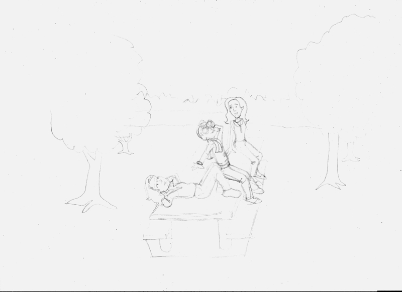
Matra from The Seeds by Jeff Davis


As a kid, I was always drawing. Usually heroes and dragons. Facing them, riding them, conjuring them, my characters were always captured within an action. Something was going on. I would sit and stare at them, waiting to find out how their stories played out in my mind’s eye. The stories were always so much more intriguing than my meager talents could portray. It was as if each drawing was seen through a window into whatever world I was dreaming up.

Fast forward to the present.

 Writing blog posts, web copy and promotional materials doesn’t leave much room for fantastic characters or muscle-bound heroes, even though that kind of writing does weave a narrative that’s suppose to whisk you off to a more utopian world. But fantasy fiction? Ah! 

That’s the thing.

When I started writing my first fantasy novel, “The Seeds”, it was written in my head far longer than it has existed in print. I would watch the characters move through scenarios in my mind’s eye, just like when I was a kid.  But, where a budding artist can draw a sword in a hand if the situation calls for it, a writer must make having that sword consistent, it must make sense.

 As an exercise in continuity, I decided to create a more complex set of designs for my first major effort. Each of the main characters was created in full color that I could pull up when necessary. Does he carry a sword? I might want to mention that fact somewhere before he whips it out. Physical descriptions? To avoid the characters from becoming perfect in every way, some boundaries are needed.

But, the most surprising and most frequent use of these visual references came when writing dialogue.

Witty banter is fun to write, and usually rolls right across my keyboard. For Varia and Dartura of “The Seeds”, being twins makes their conversations appear pointed and clipped. They know what the other is going to say almost before it's said, so only what is needed is expressed. It’s almost like the lossy compression of video for the web; only the pixels that change from the last keyframe are rendered. (If that makes sense to you, Yay! You’re a geek like me!)

But, it was the shadowy antagonist that vexed me.

How many times can one rely on writing “Bah!” to express contempt? I had to really convey a personality that I didn’t have in me--that of a conniving trickster old enough to be bored with her world, yet sinister enough to care little for the damage she does. So, I created Matra in graphic form.

Her eyes would stare malevolently at me as I posed questions to her. I would form dialogue, out loud, and actually ask if that was what she would say in that scenario. She didn’t really answer. (Thankfully, or I might be writing this from a padded cell.) But the disdain in her expression was enough for me to interpret when something worked (I hope), or when it didn’t.

I usually write whenever I get the chance, but most frequently at night, when the house is quiet. Often, my wife would open the door to my office, only to quietly close it again as I sat arguing with Matra. (“But, you hate this guy! Why would you be cordial?”) More than once my wife searched my eyes for some physical sign of the madness that was surely creeping over me. When I announced that “The Seeds” was complete, I was unsure which of us was more relieved.

Still, not only sketching but fully realizing my characters is a practice that I will continue to use as my writing improves. The illustrations take on a new life when complete, and for me at least, really form the basis of the inner workings of a character. The downside for the reader may be that they interpret the character differently, but that’s okay. I would like nothing more than for a reader to tell me, “I saw this character like this…”

If you are reading my work enough to form such opinions, it can only help me become a better writer.


Jeff Davis

____


Author bio:

Jeff Davis has worked with some of the finest high technology teams in the business and has delivered to some of the world's most recognizable companies the high quality graphics, multimedia and print materials they demand, all over the world. He majored in art and design, and he continues to regard himself as a student of the history and reinvention of popular culture. As an author, Jeff hopes to bring his unique ideas to life in this medium. A visitor to his studio office will be treated to the sounds of Led Zeppelin, Sheryl Crow, Kate Bush and traditional Celtic music. Jeff resides an hour north of Manhattan, N.Y. with his wife and two children. www.jdsavage.com/theseeds.htm


THE SEEDS 


This is not your grandmother's fairy tale. A fantasy novel that turns the genre on its head, "The Seeds" follows Trooper Angus Mayweather as he is thrust into the conflict faced by twin sisters Dartura & Varia, Generals of the Tarol Nation. As the sisters uncover a new threat from an old enemy, Angus must do what he can to help as the Tarol Nation faces all-out war.


Click here to check out drawings of Characters from“The Seeds”.
Order "The Seeds" from Smashwords
Find Jeff Davis on Google+Facebookor Twitter @JDSavageTV


Do you find drawing from other mediums helps you with writing?  If so, what medium, and how does it help? Do you have a picture of your main character or a place in your story? Does listening to a certain kind of music put you in the right mood? If you haven't thought of using pictures this way before, how do you think they might help  you? What would you ask your main character, and how do you think your main character would respond? 

Please leave your answers in the comments below. Thanks!

Monday, May 21, 2012

Would you like to write a guest post for my blog?

I'm looking for guest posts--not just from other writers and illustrators but from anyone who is passionate about books for kids and teens: librarians, teachers, book lovers, graphic novel fans, book designers, editors, agents, book bloggers, book sellers, you name it.

Any guest post would have to fit my blog, and it can't be something that I've already done or could do on my own. Check out my previous posts to get a better idea of what fits. I mostly blog about writing, illustrating, publishing, books, and geek culture--all things that I love!

The best guest posts should have a personal slant and provide something only you can provide. Are you a writer who has encountered a particular struggle in your writing, and if so, how did you overcome it? Is there something or someone in particular that inspires you? Have you learned something surprising in your writing or publishing journey that you'd like to share? Is there a children's or YA book that has special meaning to you? If you could tell a group of writers or illustrators something you think they should know but don't, what would it be?

If you have an idea for a guest post that fits these guidelines, please leave a comment below or write to me at shevi.arnold@hotmail.com. I look forward to hearing from you.

Thanks!

Shevi Arnold

Friday, March 16, 2012

Want to get it perfect? Why that's the worst thing you can do.

I've been teaching my home-schooled daughter a course on creating graphic novels. The course is partly about writing and partly about illustrating. Both are connected. They're both ways to tell a story. The story you want to tell is up to you.


My daughter has come up with a great idea for a story, and she's very excited about it. That's wonderful. She wants to be a writer someday, and this course will teach her a lot about that. I'm teaching her a lot about that. I've been an editorial cartoonist, and I used to edit a comics magazine. Each issue of Iton HaComics (The Comics Paper), which was a Hebrew comic book comprised mostly of American comic strips, included an article I had written on a comics related topic. I also have a teacher's certificate, and am an experienced writer, editor, and illustrator, so I think I'm a pretty good teacher when it comes to this topic.


We've been using You Can Do a Graphic Novel by Barbara Slater as our "textbook." Slater shows you don't have to be a great artist to create a great comic book. I highly recommend this book to anyone interested in learning how to write and draw a graphic novel. It might be just a start, but it's a very good start.


There are some things the book doesn't get into, though, things like overcoming perfectionism. You might think perfectionism is a good thing--wouldn't it be great if we could all get it perfect the first time?--but perfectionism leads to fear, and as Yoda says,  “Fear is the path to the Dark Side. Fear leads to anger. Anger leads to hate. Hate leads to suffering.” 

First you want to get it perfect. Then you're afraid that--surprise, surprise--you can't get it perfect. You can't. No one can, especially not the first time. It's impossible. Then you get angry with yourself and with your work because you can't do the impossible. Then you hate your work, so you give up on it. And then you and your work suffer. And that does lead to the Dark Side, because you're depriving the world of the gift you could have given it, and if you go around feeling miserable all the time, you'll make the world around you miserable as well.  

You suffer because you've given up on something before you've barely started. Creating a comic book--or a graphic novel, or a short story, or even a blog post--isn't about getting it perfect. No one cares if your character's eyes look gorgeous. No one. So stop obsessing over those eyelashes, and just get the story written and the pages laid out. You can edit later, but only if you actually write the darn thing. You can change the drawings around over and over, but it will be a lot easier to do if you didn't waste ten minutes drawing eyes you might have to edit out later. 

Look at Barbara Slater's artwork. It isn't gorgeous. But it's THERE. She's done it. She created something. So has Scott Addams, the creator of Dilbert; Charles Schulz, the creator of Peanuts; Cathy Guisewite, the creator of Cathy; and many other comic strip artists who don't draw particularly well. Maybe one day you'll be a great illustrator or a great writer. Let me tell you a little secret. Even then you will not get it perfect. It's an impossible dream.

So forget about trying to get it perfect. Let go of your fear. Instead, embrace joy. Because the truth is that writing and illustrating are a pleasure. They're fun. They're all about dreaming on paper. As far as I'm concerned, they're the most fun you can have. So have a ball.

Thursday, May 05, 2011

"Where do illustrations come from?"

It might seem like magic, but it's not. Illustrating is a process, very much like writing. There are many ways to do it. Here's one of them:

1. Find a scene in the text to illustrate. I decided to add one illustration to every chapter in Dan Quixote, so I went through the book and copied and pasted scenes I thought would make good illustrations into a single file. Sometimes I picked more than one scene in a chapter, so I could change my mind later.

2. Draw character sketches. This helps make it easier to be consistent when you're drawing more than one illustration with the same character. It's even better if you can draw the same character in different poses. Find places in the text where the character is described, so the drawing fits the words. With Dan Quixote, I drew the cover first. This showed me what all the main characters looked like.
3. Start sketching thumbnails of the scene. Make these the simplest of outlines, with stick figures and so on Try to look at it from different angles. Work out the vanishing point or points. Don't settle for the first thumbnail, because the next one or the one after that could be even better. Here are two thumbnail sketches for one of the illustrations in this book.
I chose to use the angle at the top left, because it seemed more playful and open. The characters' world seems to go on forever, which is what I want for this scene, that sense of endless possibility.

4. Make an enlarged copy of your chosen thumbnail sketch, either by hand or with a copier. I used my multifunction printer.

I then used an improvised "lightbox" (in this case, placing the copy on a window in daylight and placing a piece of drawing paper over it) to trace the outline of that enlarged copy.

5. Start to sketch in the details. You'll note it says "night sky" where the sky is meant to go. I often mark large spaces that will be colored in black with an X. Draw in guidelines (for example, where the edge of the picnic table is hidden by the characters' legs), skeletal lines and so on.

6. Ask yourself if you're happy with it. If not, why not, and what can you do to fix it? I soon realized the important elements in this drawing were still too small, so I enlarged this drawing too.

7. Add the finishing touches, Play around with texture. This is all in pencil, so nothing is final until it's inked. Even then there are ways to fix mistakes, but it's easier at this stage. When you're satisfied, ink the lines you want to use while ignoring the ones you don't. Erase the pencil outline. Now scan your drawing, and unless you see something that still needs changing, you're done! Here's the finished drawing.
You might notice there are some significant differences between the preliminary sketches and the final one. I relocated the trees on the right, and Sandy's feet are closer to her body. You notice things at each stage you want to fix. (Actually, I just noticed the arm Dan is leaning on should be longer. Oh, well, too late to change that now.)

 8. Make last minute corrections. Computers can make this a lot easier provided you have the right software and hardware. I use Corel PhotoPaint (which is a part of CorelDraw), and I like it, but I haven't got used to using a tablet, and working with a mouse is even worse. That's why I'd rather do my sketches by hand and scan them in. Maybe one day I'll be able to afford a Cintiq tablet or a touch-screen computer, so I can see what I'm doing while I'm doing it.

And that's it. The most important thing to remember is to have fun.