Monday, May 30, 2011

Trailer


I've donated a custom-designed book cover,  blog, or book trailer to the SCBWI NJ conference raffle to benefit SCBWI members who need financial support. Here's my trailer for Why My Love Life Sucks to give an idea of what I can do. This was created on my Mac using iMovie. The donation includes music, fonts, transitions, and stock photography or illustrations from iStockPhoto.com, BigStockPhoto.com or similar services.

I look forward to working with the winner!

Shevi

Sunday, May 22, 2011

The Kindle with ads isn't that great, but not for the reasons you might think

I've had an Amazon Kindle with ads for about a week now, and I'm still on the fence about it. So far I only see a few pros to owning this ebook reader, and quite a few cons. Oddly, the ads are not among the cons. So here's my pros and cons list:

Pros
  • The liquid paper--Compared to the back-lit iPad,iPhone or iPod Touch, the liquid paper is easier on the eyes and it means you can go a long time between charges. But do you know what's even easier on the eyes and doesn't need to be charged at all? An actual book. 
  • The price--At $114, this is one of the cheapest ebook readers. 
  • The Amazon Kindle store's selection and pricing for ebooks--Amazon has the greatest selection of ebooks at the lowest prices.
  • The ads--The ads appear when the Kindle is shut off. When you turn the Kindle back on, a small strip at the bottom of the menu lets you click on a link to learn more about the product or offer. The ads don't bother me in the least, and when they offer something good (who wouldn't want a $10 Amazon gift certificate for buying a $5 ebook from the bestseller list?) I kind of wish there were more of them. Right now my only complaint about the ads is that they're repetitive and I can't tell the Kindle to stop showing me ads for some car and some beauty product. My guess is that in the future, the ads might be better tailored to the actual user. This would benefit both the Kindle owner and the advertiser.
  • Get any book you want within seconds--It's literally like holding a bookstore in your hand, but unfortunately this isn't a bookstore you can check out easily, no bargain bin or covers to look at or anything. (See below.)
Cons
  • The user interface--the placement of the buttons can be quite frustrating. There are buttons on each side of the screen to move you forward and backward. Press the top button, and you move back. Press the bottom button, and you move forward. This only applies to navigating books. To move back a page anywhere else, you need to press a tiny back button on the keyboard. Why? Why not have the same buttons take you back and forward a page no matter where you are? And why not just put one back button to the left of the screen, and one forward button to the right of the screen, which would be more intuitive? The main button you use on the keyboard (the one that lets you move up, down, left and right within a page) is tiny and difficult to manipulate. This is true of all the buttons on the keyboard, but because this one button is so important, its tiny size and the way it's situated so close to the Menu, Back, Delete, and Enter keys can be quite frustrating, making the simplest tasks take unnecessarily longer.
  • The on-board Kindle store--Unless you're interested in the bestseller list only and you don't care about price, the Kindle store as you can access it from your device is pretty much useless. You can't look up books by rating or price, and very often when you look something up by topic, the first things on the list are rubbish created by writers who have created lots and lots of ebooks in order to boost their ratings in the Kindle store. Sometimes they'll add something to a public-domain work (like drawings), so they can charge for an ebook you can get for free elsewhere online. This effectively makes the on-board Kindle store a joke, and the laugh is on the person trying to use it to find a book he or she might want to buy.
  • The price of some ebooks when compared to used books--If you want to read books on your Amazon Kindle, you're stuck with whatever the price is on Amazon. Sometimes that's a good thing. Many indie publishers charge $0.99-$2.99 for an ebook. However, most of the larger publishers charge $9.99, and sometimes more. So unless you have money to burn or really need to get that bestseller as soon as it comes out and you're willing to pay retail for it, you're probably better off getting a used (sometimes even new) paperback for a much lower price.
  • Everything the Kindle offers beside books--While some of the apps are nice (Mahjong, for example, looks lovely), the interface makes them unbearably frustrating to use. The worst is trying to access the Kindle store through Amazon's website. Sure, it's great that the device can access the Internet, but does it have to do such a terrible job of it? Frankly, I think Amazon needs to get rid of that feature until they find a way to make using it frustration-free.
In the end, the pros win out over the cons, but the cons show that Amazon still has a long way to go if it wants to get a Kindle into every reader's hands.

Thursday, May 05, 2011

"Where do illustrations come from?"

It might seem like magic, but it's not. Illustrating is a process, very much like writing. There are many ways to do it. Here's one of them:

1. Find a scene in the text to illustrate. I decided to add one illustration to every chapter in Dan Quixote, so I went through the book and copied and pasted scenes I thought would make good illustrations into a single file. Sometimes I picked more than one scene in a chapter, so I could change my mind later.

2. Draw character sketches. This helps make it easier to be consistent when you're drawing more than one illustration with the same character. It's even better if you can draw the same character in different poses. Find places in the text where the character is described, so the drawing fits the words. With Dan Quixote, I drew the cover first. This showed me what all the main characters looked like.
3. Start sketching thumbnails of the scene. Make these the simplest of outlines, with stick figures and so on Try to look at it from different angles. Work out the vanishing point or points. Don't settle for the first thumbnail, because the next one or the one after that could be even better. Here are two thumbnail sketches for one of the illustrations in this book.
I chose to use the angle at the top left, because it seemed more playful and open. The characters' world seems to go on forever, which is what I want for this scene, that sense of endless possibility.

4. Make an enlarged copy of your chosen thumbnail sketch, either by hand or with a copier. I used my multifunction printer.

I then used an improvised "lightbox" (in this case, placing the copy on a window in daylight and placing a piece of drawing paper over it) to trace the outline of that enlarged copy.

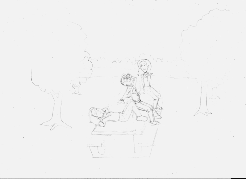
5. Start to sketch in the details. You'll note it says "night sky" where the sky is meant to go. I often mark large spaces that will be colored in black with an X. Draw in guidelines (for example, where the edge of the picnic table is hidden by the characters' legs), skeletal lines and so on.

6. Ask yourself if you're happy with it. If not, why not, and what can you do to fix it? I soon realized the important elements in this drawing were still too small, so I enlarged this drawing too.

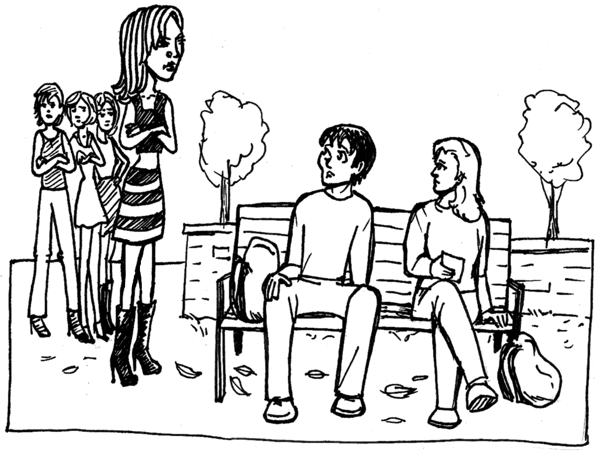
7. Add the finishing touches, Play around with texture. This is all in pencil, so nothing is final until it's inked. Even then there are ways to fix mistakes, but it's easier at this stage. When you're satisfied, ink the lines you want to use while ignoring the ones you don't. Erase the pencil outline. Now scan your drawing, and unless you see something that still needs changing, you're done! Here's the finished drawing.
You might notice there are some significant differences between the preliminary sketches and the final one. I relocated the trees on the right, and Sandy's feet are closer to her body. You notice things at each stage you want to fix. (Actually, I just noticed the arm Dan is leaning on should be longer. Oh, well, too late to change that now.)

 8. Make last minute corrections. Computers can make this a lot easier provided you have the right software and hardware. I use Corel PhotoPaint (which is a part of CorelDraw), and I like it, but I haven't got used to using a tablet, and working with a mouse is even worse. That's why I'd rather do my sketches by hand and scan them in. Maybe one day I'll be able to afford a Cintiq tablet or a touch-screen computer, so I can see what I'm doing while I'm doing it.

And that's it. The most important thing to remember is to have fun.

Wednesday, May 04, 2011

Hope you like these illustrations I made for Dan Quixote


Why less description might be a good thing

“Psychologists have shown that over describing a character is a bad thing, because it doesn’t let readers fill in the blanks, which is necessary because it helps readers see themselves in the character’s shoes.” This is what an editor told me at an odd sort of writer’s conference . . . in a dream. Apparently I’m getting reassured at writers conferences in my dreams now, and this particular conference looked a lot like summer camp, except with adults wearing suits. The editor wore a funny hat, and she had the bunk bed under mine.Oddly, the advice still seems to make sense.

Monday, May 02, 2011

What you always knew about high school but wished you didn't.

According to The Geeks Shall Inherit the Earth by Alexandra Robbins, bullying in American high schools is worse than ever. What's even more troubling is that teachers and the educational system itself--which places athletes and cheerleaders above scientists and artists--is partially to blame.

The only good news is that bullying generally ends when high school does, which gives geeks and other outsiders the chance to finally shine. But if our educational system is meant to turn children into successful adults--and not not meant to be a something most kids have to suffer through before they're allowed to be all that they can be--shouldn't this book be a wake up call?  http://www.salon.com/life/feature/2011/05/01/high_school_interview

I've written about this topic extensively in Dan Quixote: Boy of Nuevo Jersey and briefly in Why My Love Life Sucks: The Legend of Gilbert the Fixer. I do think we need to take apart and rebuild our education system from the ground up. Our schools should teach our kids to be better, not bullies and victims.